// 01 · E-commerce · Growth · 2023 — 2025
Nykaa
Redesigning the post-order journey for India's largest beauty retailer
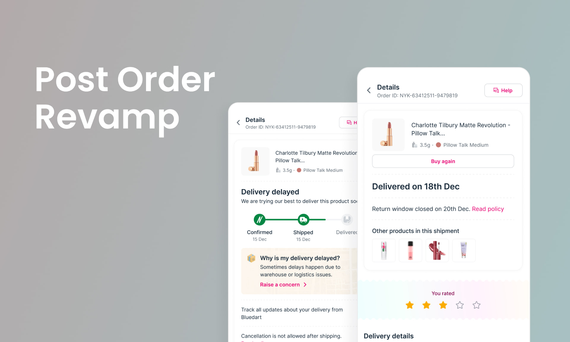
// Overview
The real problem wasn't the UI. It was years of compromise. Every patch we shipped was the best we could do within broken infrastructure — fragmented logistics, multiple inventory models, legacy systems never built to scale. No single fix would change that.
3.3 million monthly orders. CS overloaded. Users anxious — after they've paid, whether waiting, returning, or chasing a refund. This is the story of how I made the case for a ground-up rebuild, got the buy-in, and led it.
// Problem & context
Post-order at Nykaa wasn't ignored — it was constantly being worked on. But every change was dictated by the systems underneath: fragmented logistics, multiple inventory models, legacy tech with its own rules. Design was reflecting infrastructure, not user needs.
The result was an experience built around “this is how things work” rather than “this is what the user needs.” First principles had never been applied here.
Our north star was simple: CS call volume. Happy users don't call.
// Process
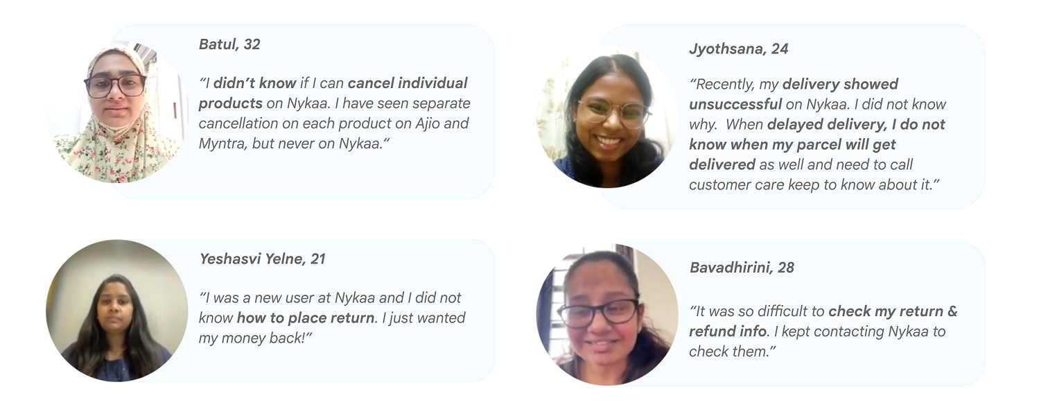
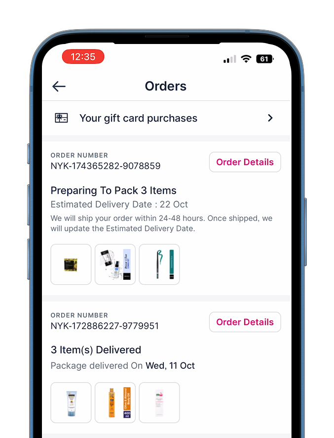
// The old experience
The existing interface mirrored the system, not the user. There was no clear distinction between “Order”, “Item” and “Shipment” — three things that mean very different things to someone anxiously tracking a delivery.
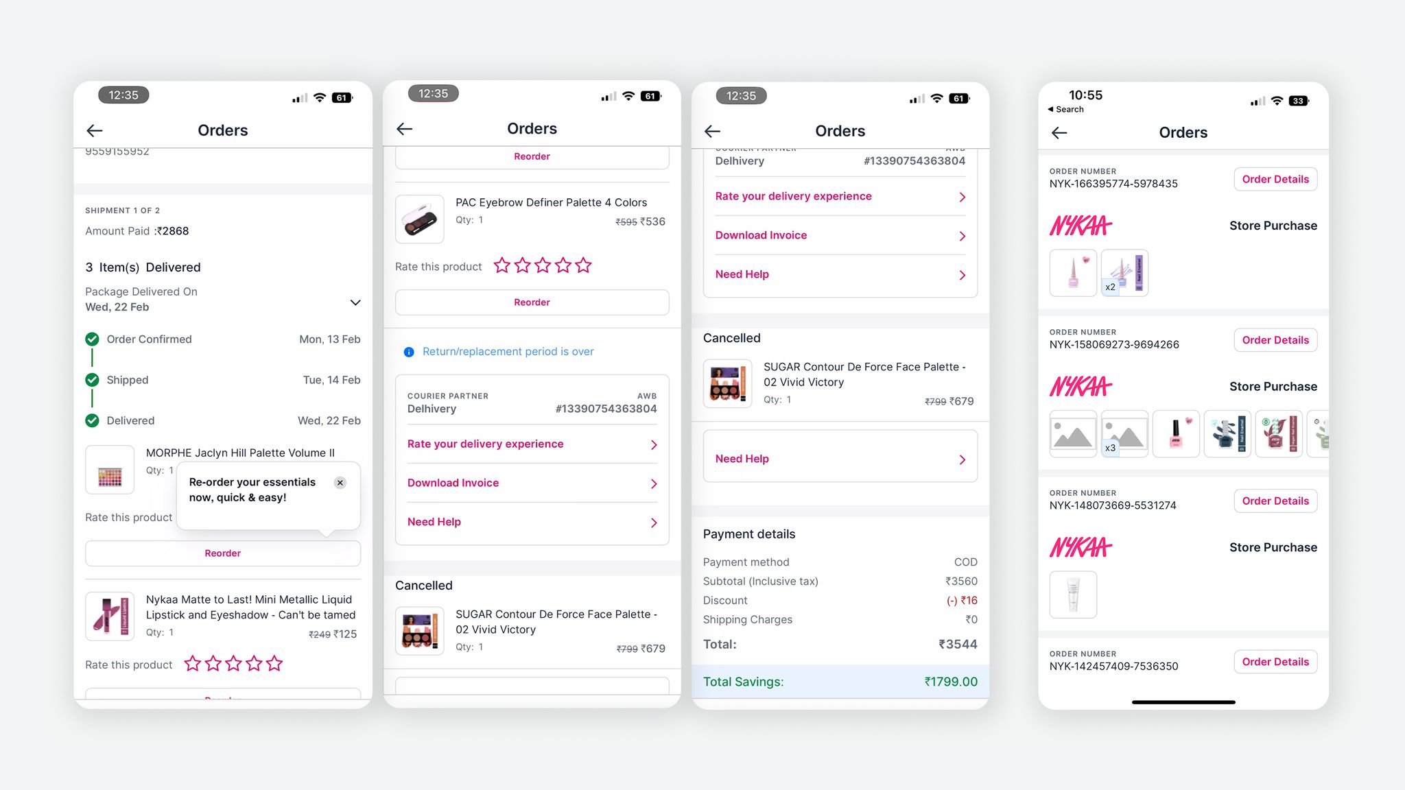
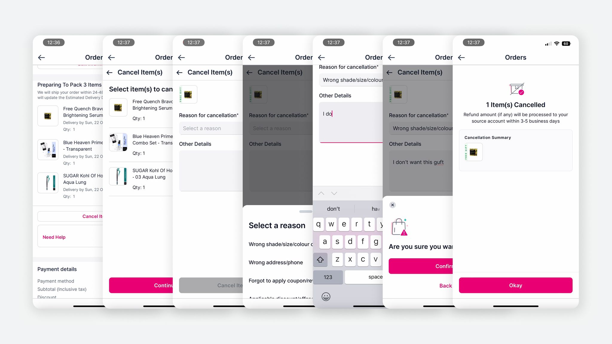
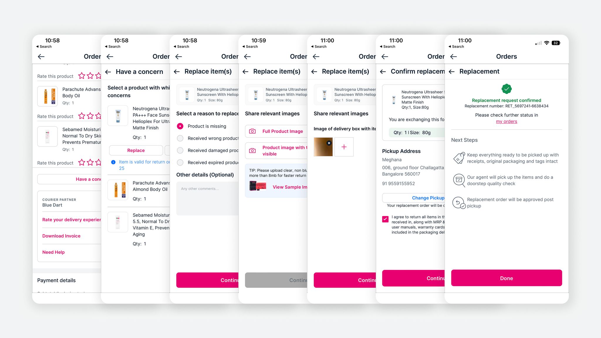
Users weren't being guided — they were left to figure it out.
// The approach
At ~3.3M monthly orders, proposing a full overhaul isn't a small ask. I made the case by letting the problems speak — competitive benchmarking showed every major platform had evolved post-order, user interviews surfaced exactly where anxiety peaked, and our practice of listening to CS calls as a design team made the gaps impossible to ignore.
The pitch was grounded in one argument: we couldn't solve these problems within the existing UX structure. Incremental fixes had a ceiling. A ground-up rethink was the only way to build something that actually worked — and could scale.
We got the go-ahead.
// The hard call: order, shipment, or item?
As a user, you think in items — “When is my lipstick arriving?” Item-level is the natural mental model, and what every major platform optimises for. But our infrastructure told a different story: one order of five products could split across two shipments, different logistics partners, different delivery dates.
We couldn't just copy Flipkart or Amazon. After significant exploration we arrived at a solution that felt item-level — matching the user's mental model — but was organised by shipment and order underneath, because that's the operational reality we had to honour. Not a compromise. A third way.
// Execution & solution
Before a single page went to engineering, we designed the full vision. Every page had to speak to the next — we weren't going to redesign the Orders page twice because we hadn't thought through the Items page yet.
Then we sliced it smartly. Engineering estimates were high, so we phased delivery page by page — My Orders first, then Item Details. Each page shipped as a complete, coherent experience. Users wouldn't see a patchwork of old and new; they'd encounter something that felt whole.
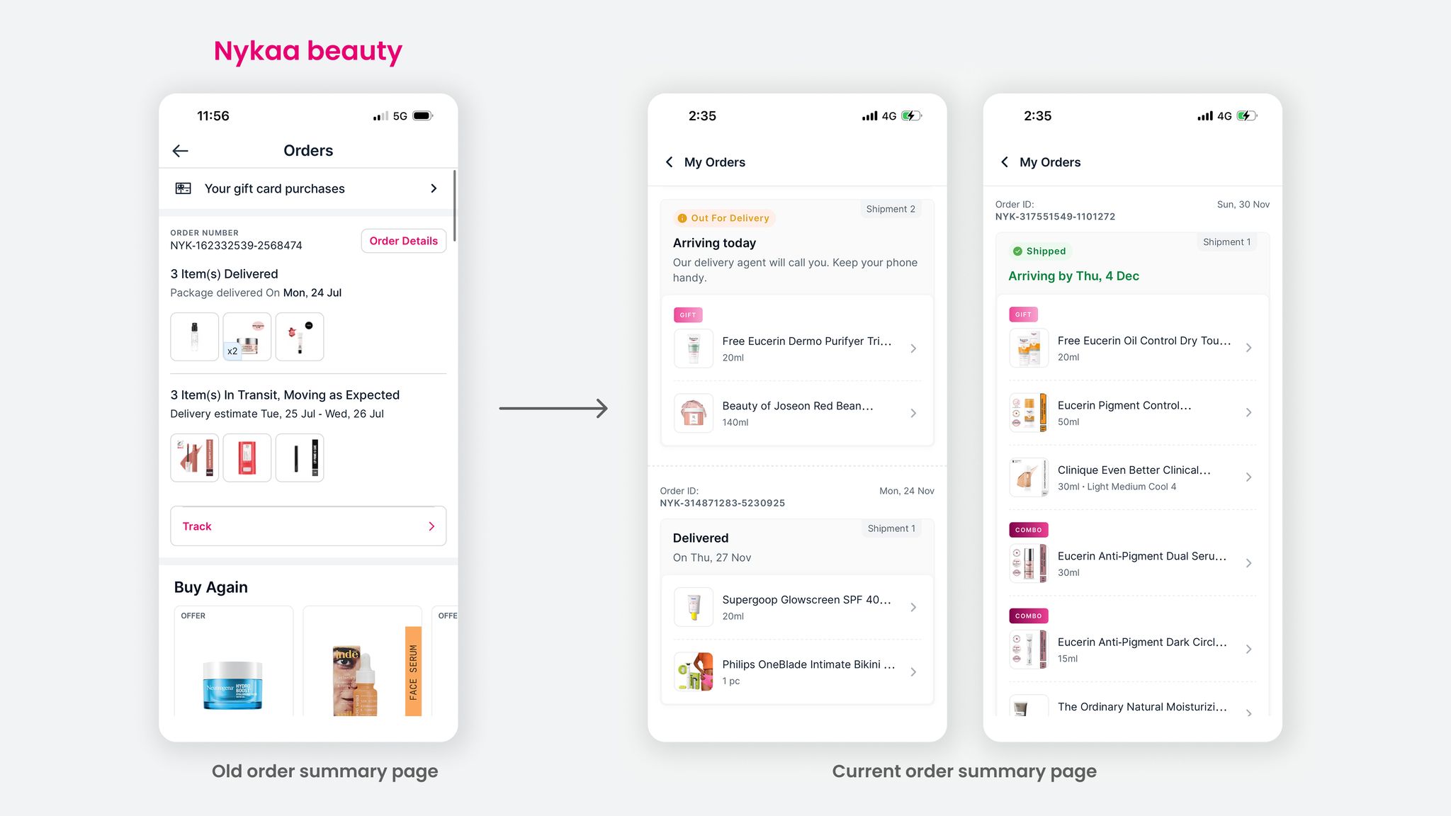
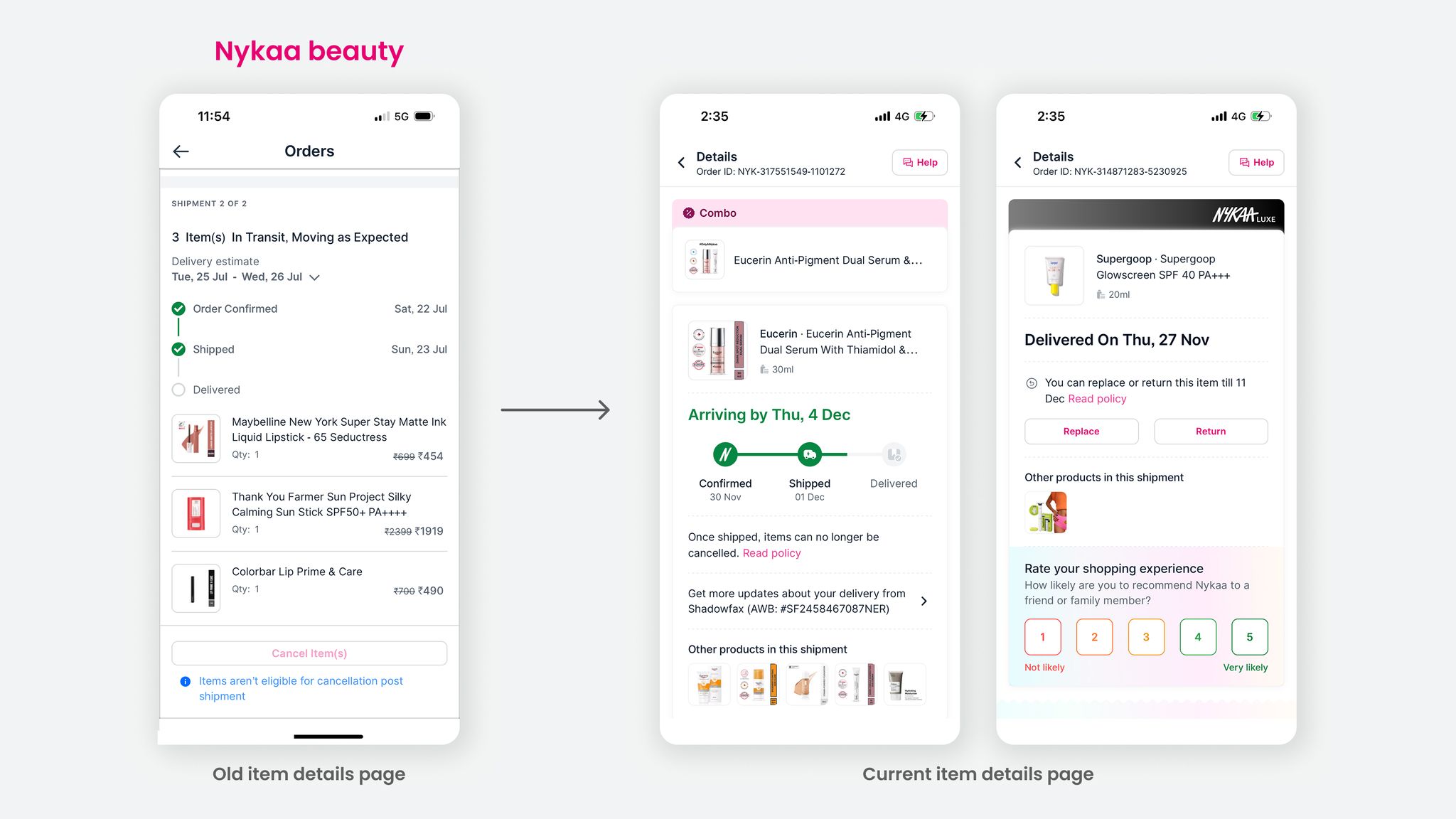
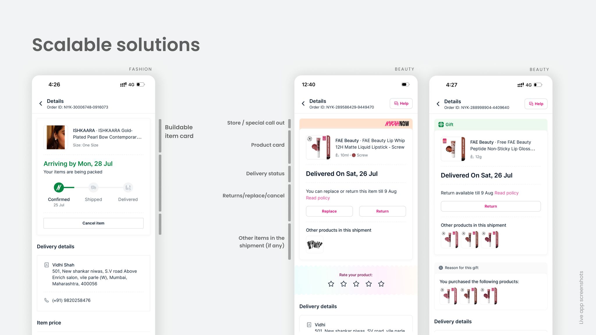
The redesign centred on shipment-level clarity with items surfaced prominently: items grouped by shipment with clear delivery dates and statuses, all primary actions within two taps, and configurable cards that could surface the right information for every use case.
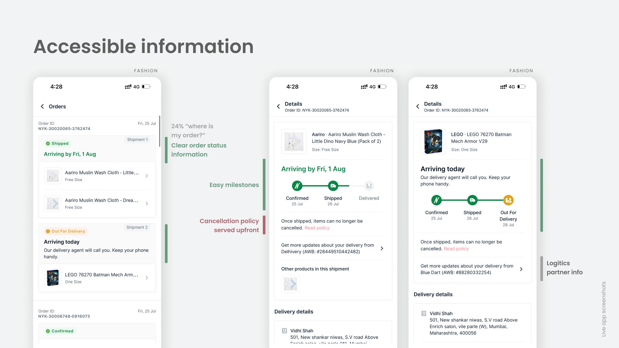
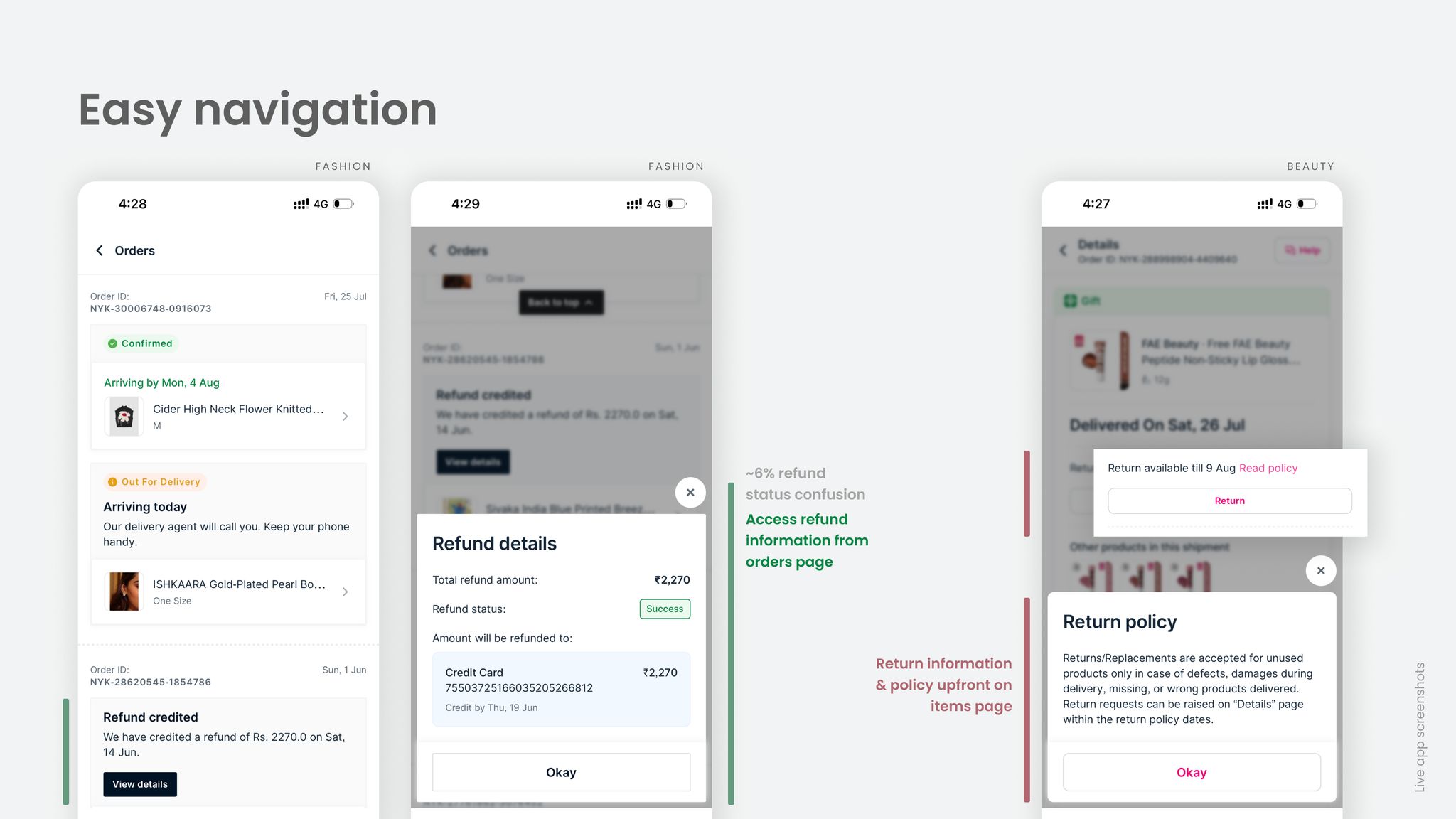
When users are anxious, copy isn't supporting the design — it is the design.
// UX writing
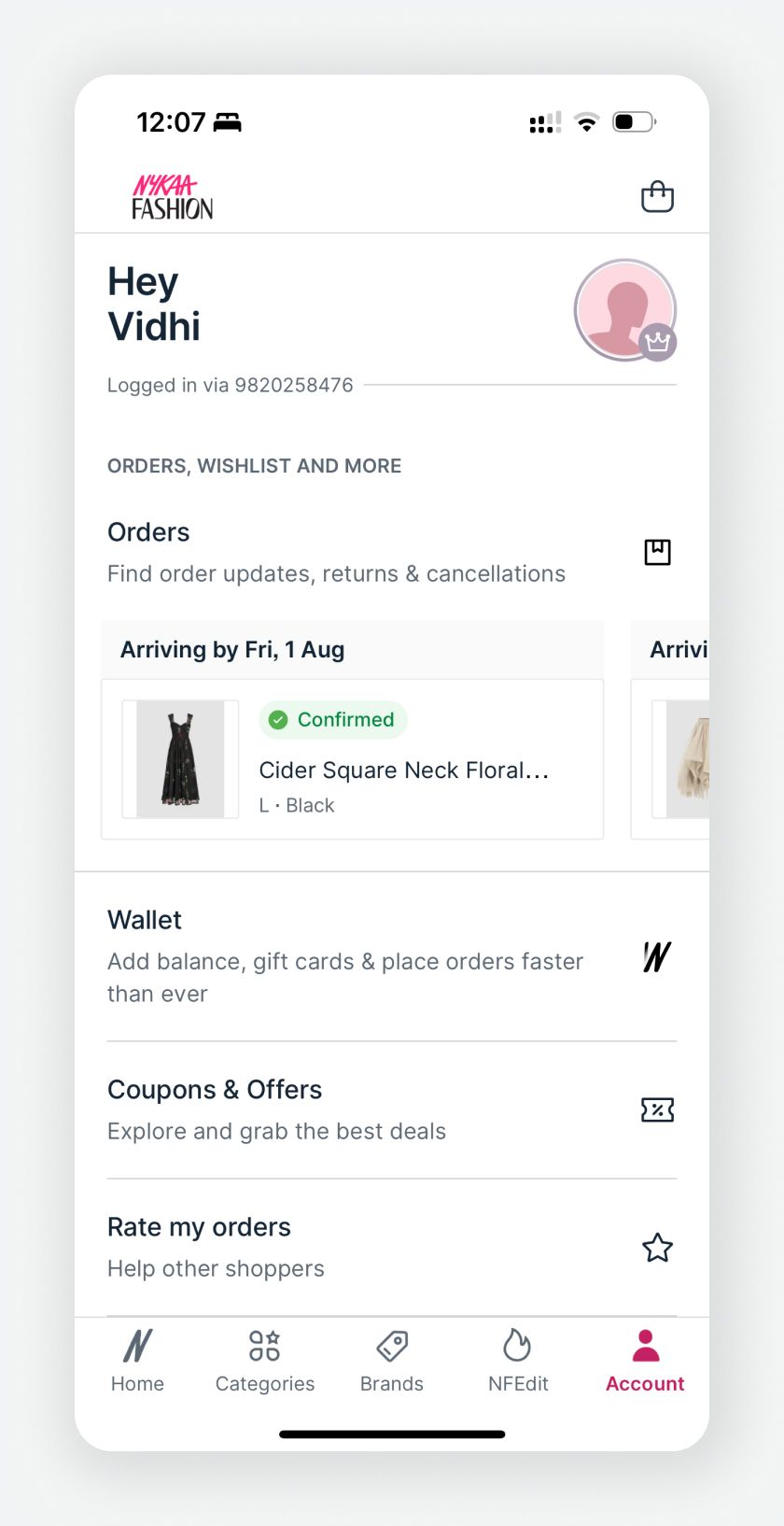
I championed UX writing as a core design decision, not a final step. Working closely with our writer, we defined when to inform vs when to apologise, how to set refund expectations without amplifying anxiety, and what tone belongs in a delay vs a completed return.
Before: “Apologies for the slight delay. We are trying our best to reach to you.”
After: “Our delivery agent is on their way and will deliver your items as soon as possible.”
// Outcomes
14% reduction in CS load for Nykaa Beauty, 7% for Nykaa Fashion, and a 22% reduction in refund-related queries.
A scalable system adopted across 200+ use cases, and a unified experience across all logistics partners and inventory models.
An org-wide shift — from reactive support recovery to proactive CX design.
// Next up