// 02 · E-commerce · Conversion · 2023 — 2025
Nykaa
Rebuilding checkout to unlock bottom-funnel growth
// Overview
At Nykaa, 70% of repeat customers don't change their delivery address and 40% don't change their payment method — yet every order forced them through the same long checkout flow.
We bet that a faster, pre-filled path for returning users would lift conversion without breaking trust. After three iterations, Express Checkout delivered ₹44 Cr in topline impact, with a clear runway to ₹60 Cr+.
// Problem & context
Repeat buyers are the backbone of Nykaa's volume. But checkout treated them like first-time users — same long page, same decisions, same friction.
~70% stick to the same delivery address. ~40% use the same payment method. The insight wasn't that people repeat — it was that we were charging them a decision tax for behaviour they'd already locked in.
The question I took to the team: if most returning users have already made these decisions, why are we asking them to make them again?
// Process
// The bet
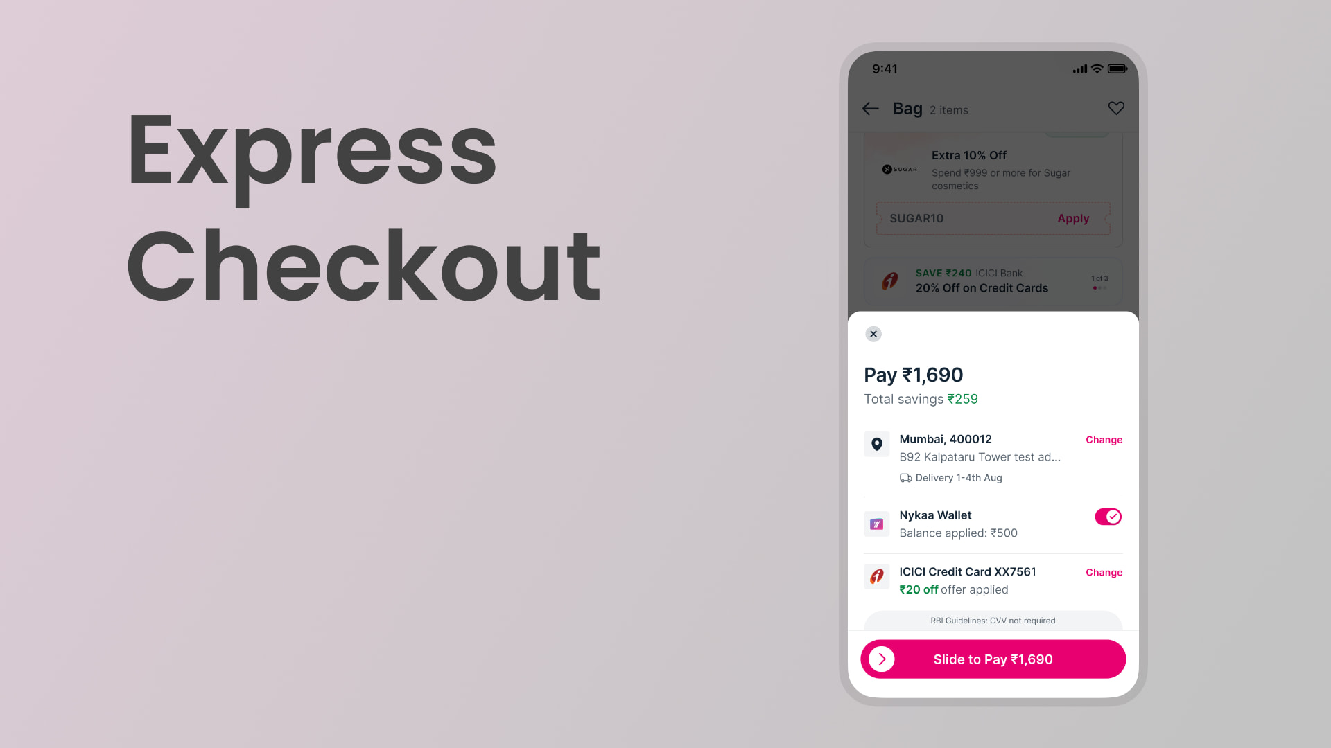
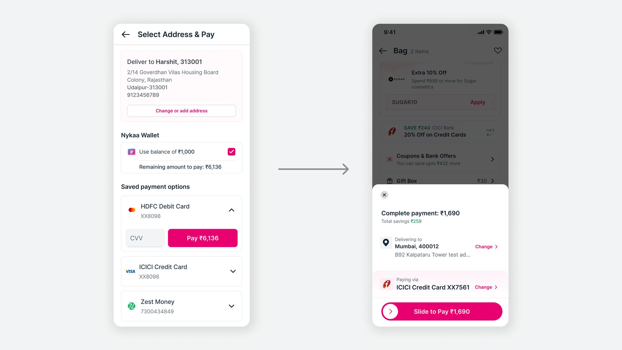
A bottom-sheet experience for repeat users that pre-fills last-used address and payment method, surfaces savings, and lets them confirm in one motion — while keeping change options one tap away.
Not a redesign. A shortcut. A fast lane that respected returning users' time without taking control away from them.
// Phase 1 — we shipped speed. Users rejected it.
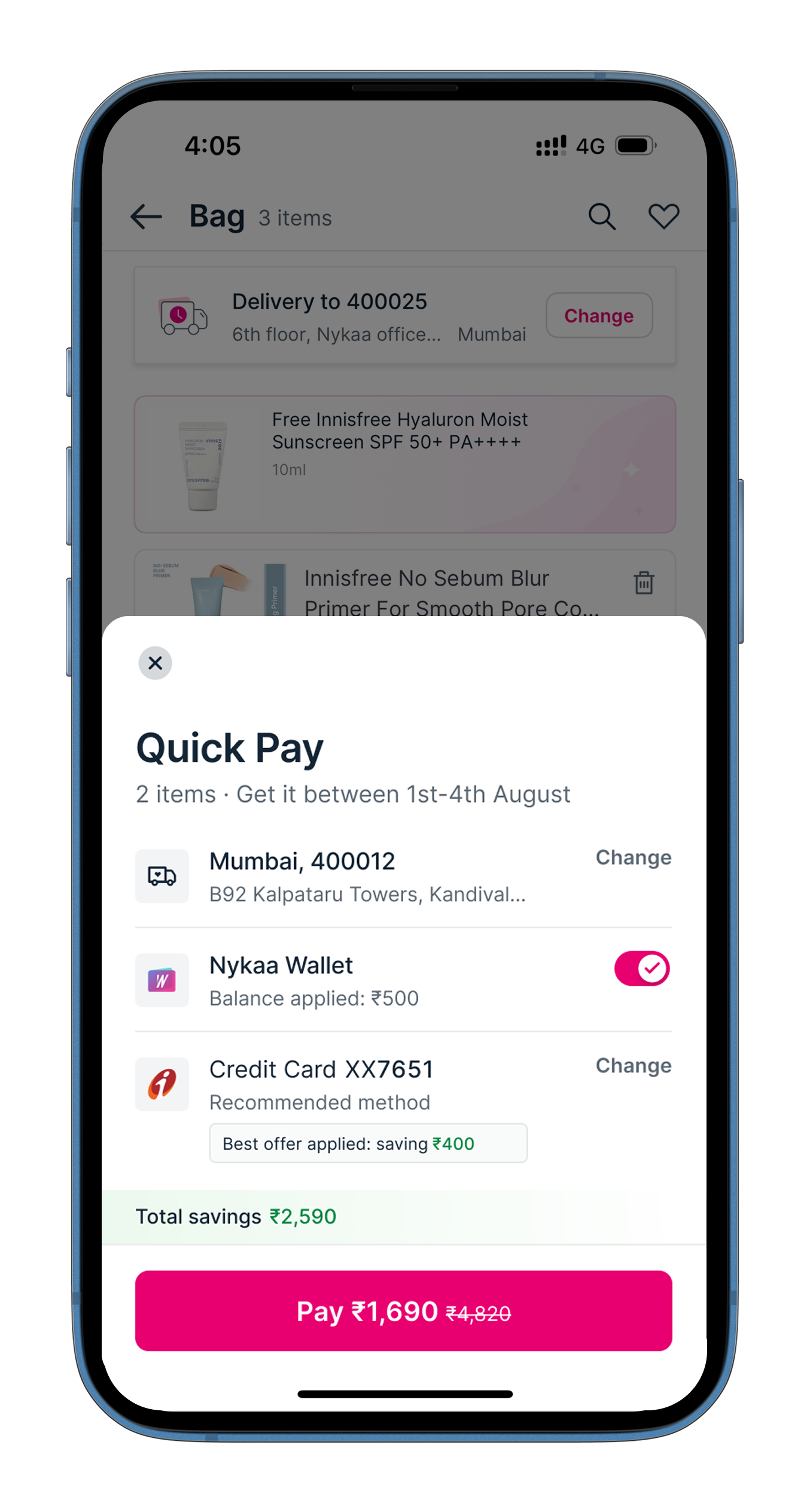
Our first version — Quick Pay — was built on one hypothesis: returning users want to pay faster. It showed a delivery estimate and let them pay in one tap. It backfired. Drop-offs went up.
Our hunch: users hadn't registered what the screen was asking of them. As creatures of habit they tapped the CTA like any familiar button — and were surprised when the payment gateway loaded. We'd skipped the moment of recognition they needed. Speed without context isn't speed, it's anxiety.
Speed without context isn't speed, it's anxiety.
// Phase 2 — context before speed
A series of educated guesses, tested internally and refined each cycle. We replaced the “Quick Pay” CTA with the final payable amount and total savings, swapped tap for slide-to-pay — a small, deliberate friction that forces the user to notice — and questioned every word on the sheet, cutting everything that wasn't the decision.
Impact: +240 bps uplift in Checkout → Pay Now, +80 bps overall Checkout → Order, −150 bps softness in Pay Now → Order (mostly OTP/PIN drop-offs), payment success rate 68.8% vs 72.2% in the regular flow.
// Phase 3 (live) — closing the trust gap
The numbers were positive, but qualitative research flagged a softer issue: “Which payment method is this using?” “How do I change it?” “That felt too quick — I wasn't sure what just happened.”
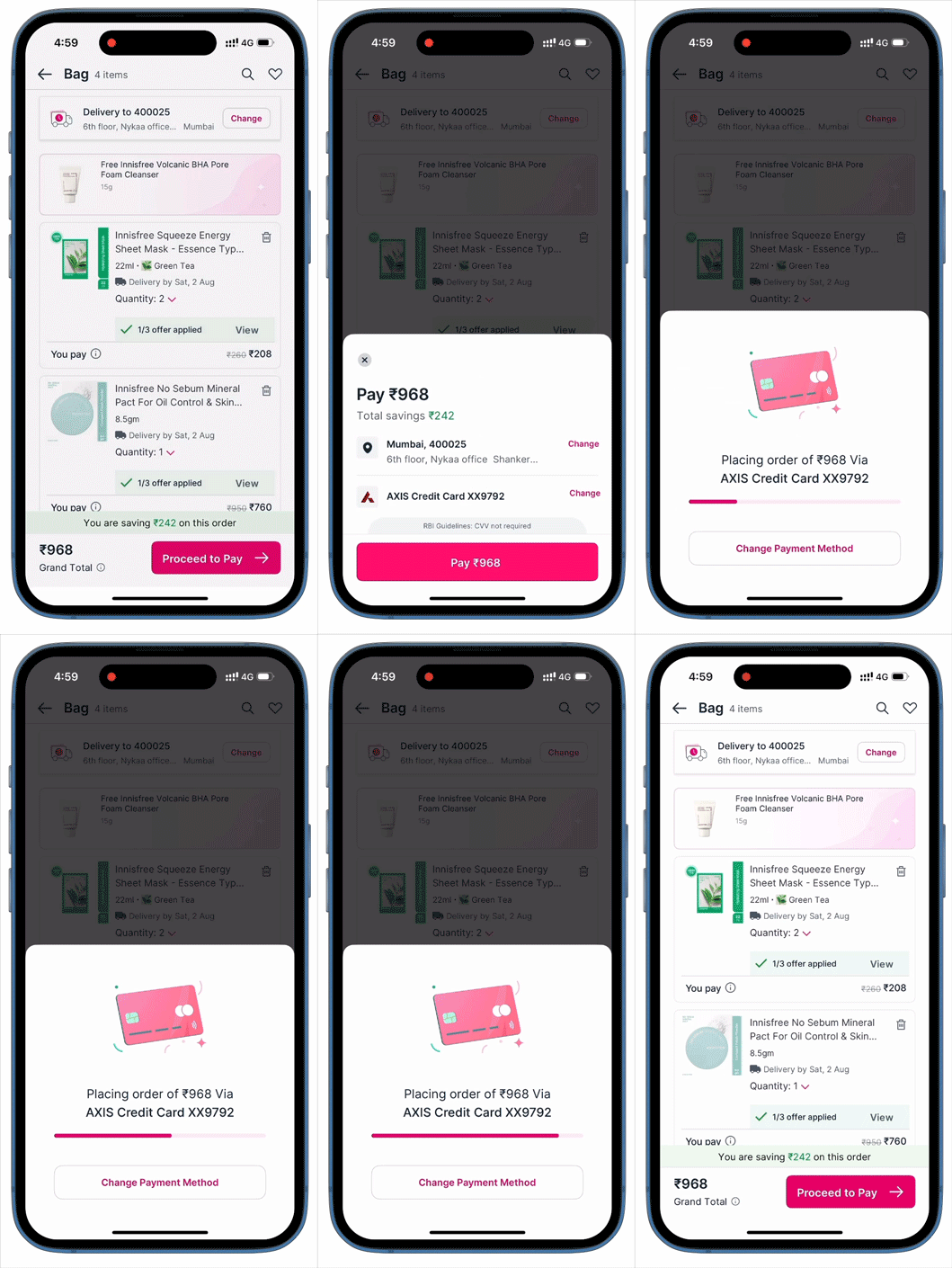
Two changes: a short, deliberate delay that read as progress, and the payment method visually anchored on the sheet so users could see exactly what was about to happen. Impact: incremental +25 bps lift, smoother progression, fewer reversals.
// What's next
Checkout isn't a space you can observe users in real time — there's no usability lab moment mid-payment. Every next move is designed on secondary research, internal testing and product judgment, which means the calls on what ships next sit with the design team.
The roadmap: motion and micro-delight in the confirmation moment, smarter pre-fill logic using behavioural signals rather than last-used, an OTP/PIN redesign to recover the −150 bps drop-off, and deeper personalisation for high-intent users.
// The bigger questions
The work also opened up larger questions I'm pushing with stakeholders. What's actually stopping us from a one-page checkout? How do we surface the right payment offer on top — automatically? Why have a payment page at all? Can users pay directly from cart?
// Outcomes
₹44 Cr in topline impact, with every 1% improvement worth roughly ₹60 Cr more.
Phase 1's failure and Phases 2 and 3's lift confirmed Express Checkout wasn't just a successful experiment — it was a permanent shift in how returning users experience checkout at Nykaa.
// Next up