// 04 · B2B SaaS · Global · 2019 — 2022
Cactus
Editage 2.0: designing trust, globally
// Overview
An author spends a considerable amount of time on their research — in some cases, it's synonymous with their entire life. Their skills lie in the subject area, not necessarily in writing a paper. Editage is where they come for help: editing, translation, journal selection, cover letters and more.
A platform that serves 729,000+ researchers from over 191 countries across 1,100 research fields. A business that ran well for 17 years banking on market need was now ready for a tech upgrade — and we intended it to become the leading user-friendly product in its market.
// Problem & context
The old website was dated and generic, hiding the breadth of services under menus and asking researchers to hand over unpublished work and a few hundred dollars on faith.
Trust — not features — was the conversion blocker, and one global template ignored how differently researchers in China, Japan, Korea and the rest of the world evaluate credibility.
// Process
// Editage that was
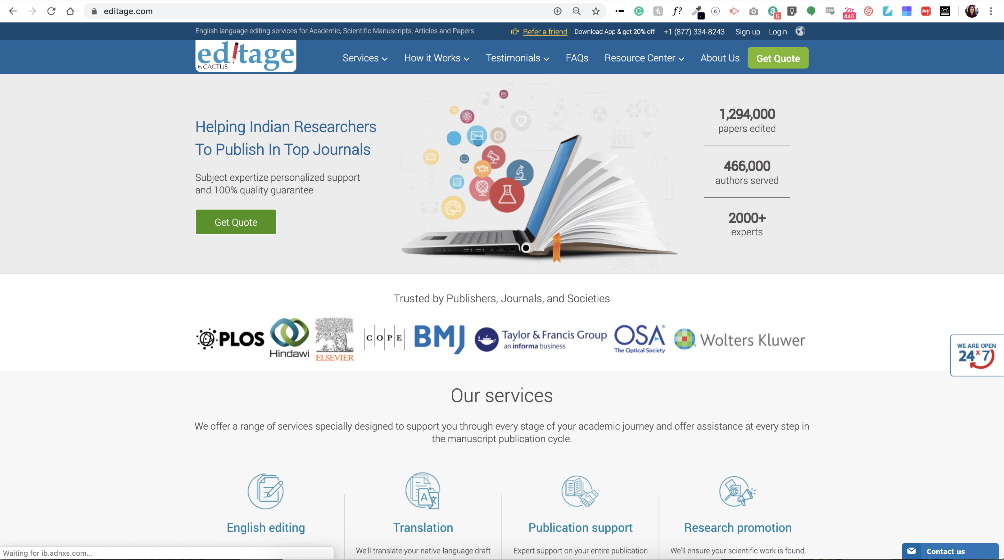
Services buried under menus, little sense of quality or guarantee, and a look that didn't match the global standard our authors were comparing us against.
// And thus the research began
We went wide before we went deep:
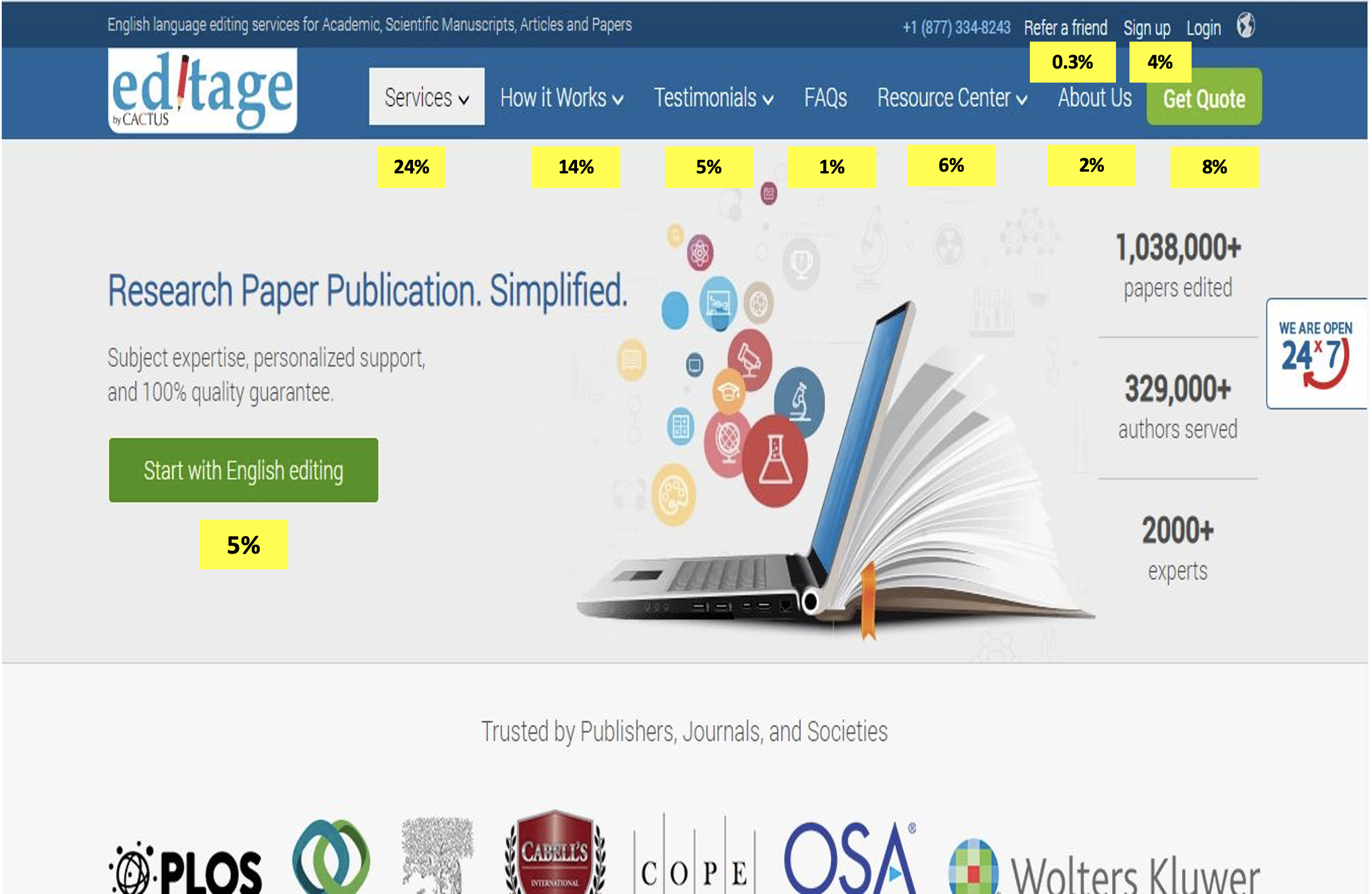
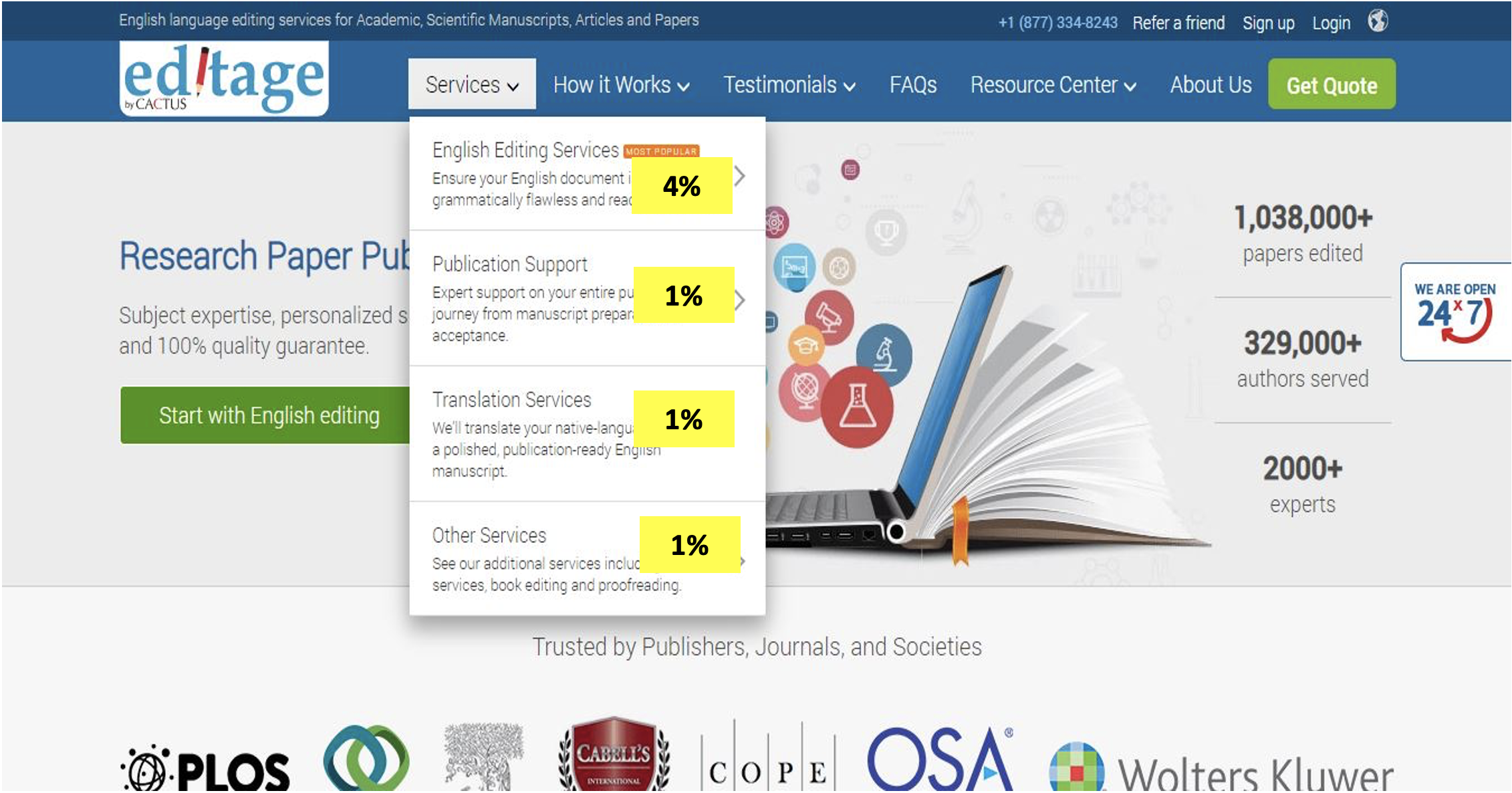
3,000+ pieces of service feedback across four markets. A review of 1,000+ chat transcripts. 1,200+ user session replay videos watched. Click maps and customer route mapping. Keyword and SEO analysis. A tech stack evaluation. Personal feedback from stakeholders across the organisation. And an analysis of our top 5 competitors — their offering, pitch and packaging.
// Key insights
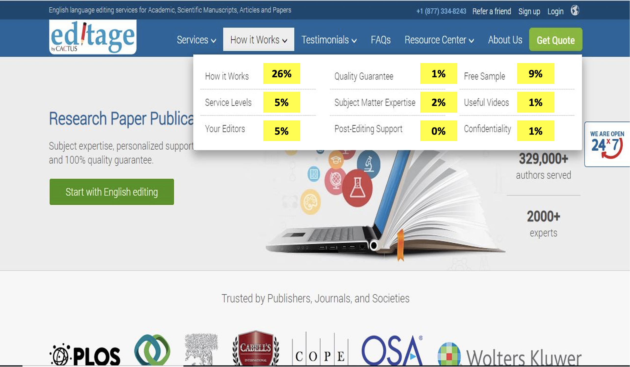
Insights were split into what users look for before deciding to transact and what they need after they start. Three themes kept recurring:
Users are most curious about how it works. Users need to trust Editage for its quality. And users may not know we offer anything beyond editing.
Trust — not features — was the conversion blocker.
// Goals for Editage 2.0
Communicate clearly about the offerings, with enough information to decide. Make it easy to find what you need with a simpler flow. Be bold and assertive about quality and guarantee. Look global yet appeal to the local audience. And with that ease of understanding, encourage users into the forms to submit more orders.
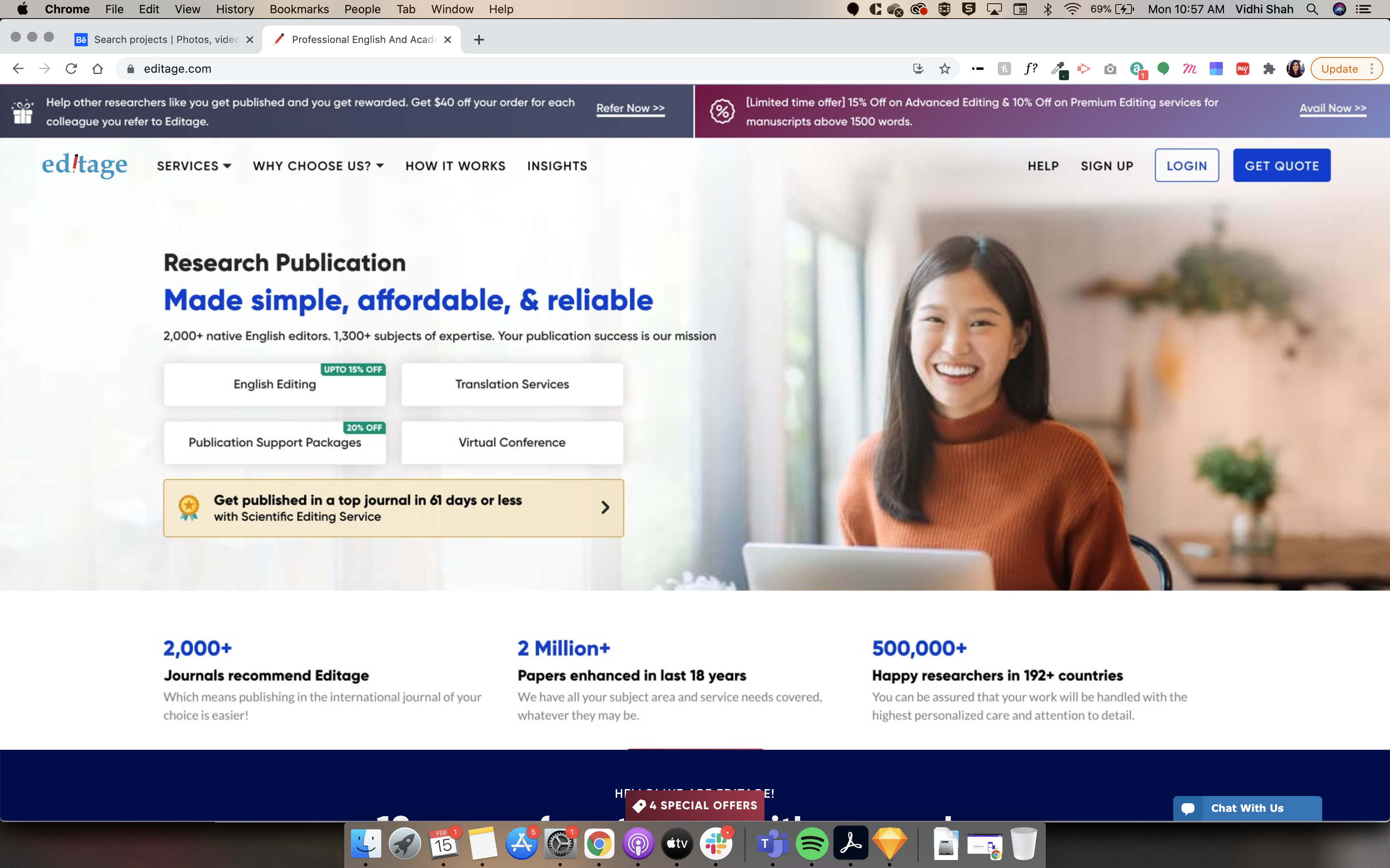
// 1. Bespoke market images
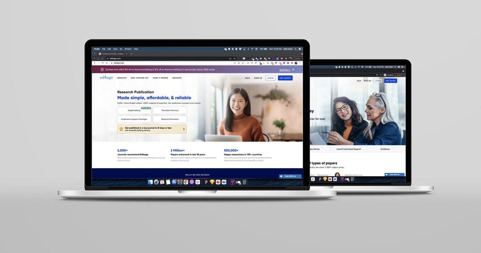
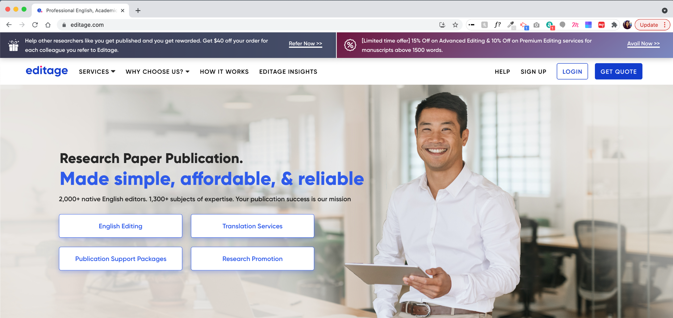
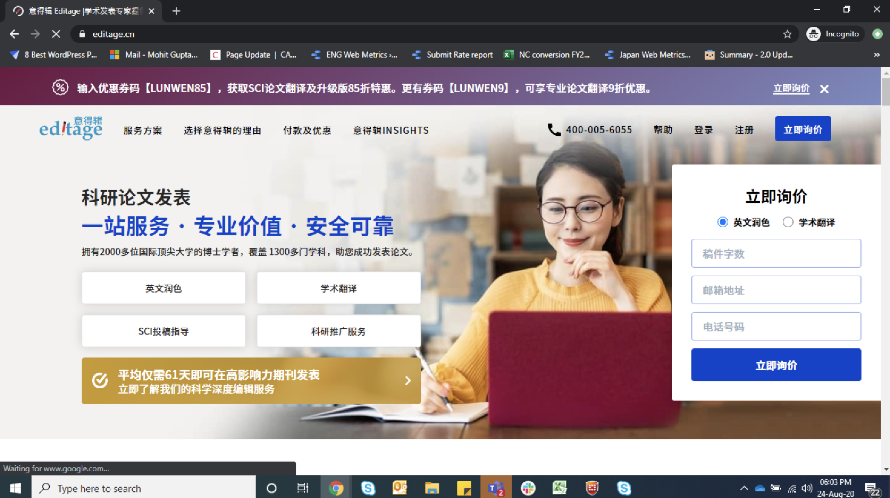
The first thing you see. Every homepage carries an image of a person representing the ethnicity of the authors, looking directly at the user for connection and providing a visual break. Chosen to feel optimistic, natural and local.
// 2. A service-driven architecture
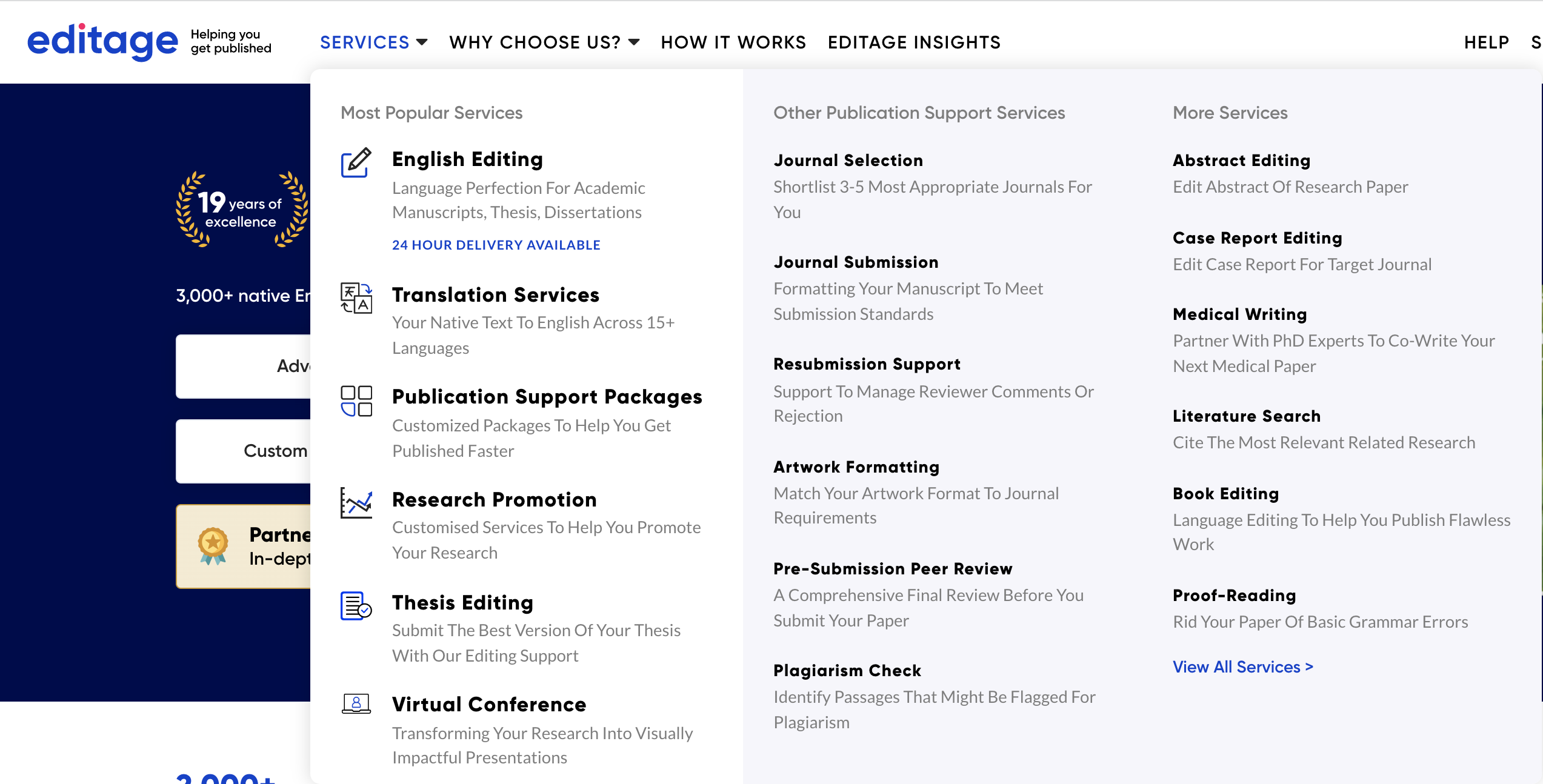
Categorising services clearly so users see the length and breadth of the offering — instead of hiding it under menus like the older website did.
// 3. Social proofing
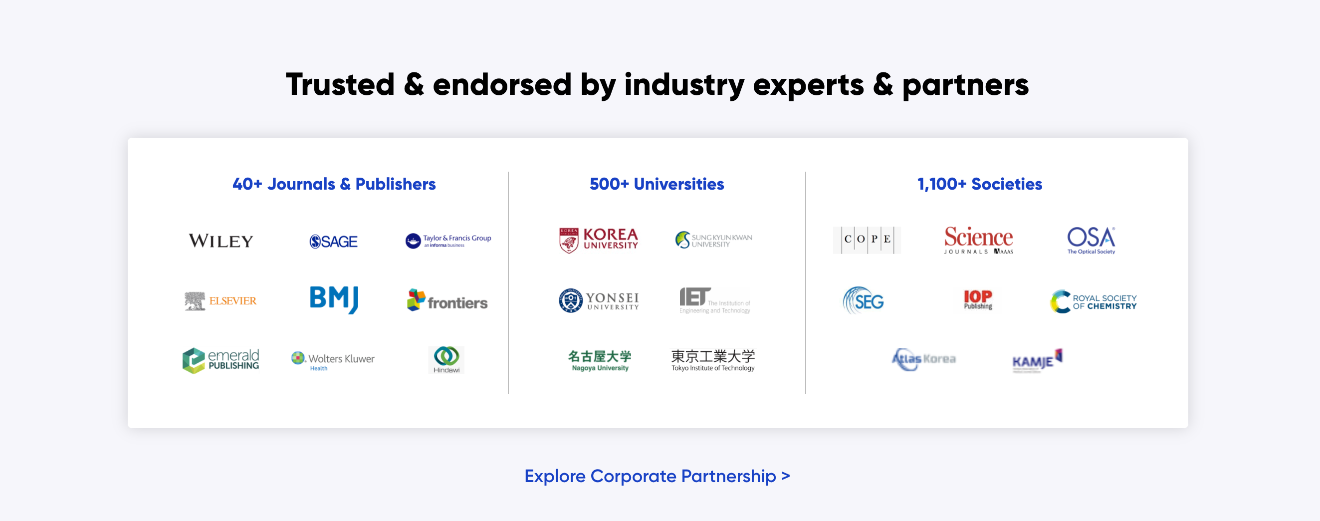
Letting the numbers speak for themselves. Editage has helped 50,000+ authors so far and continues to grow every day. When the numbers are impressive, why not use them?

// 4. Voice and tone
Our authors read. Session videos and data told us they're happy to read a lot on the website — the detail itself signals quality. So while we expect them to read everything, we chose to sound less transactional and more conversational: “publication journey”, “support”, “collaborating” — words that make us a partner, not a vendor.


Reassurance = trust.
// 5. The Editage quality promise
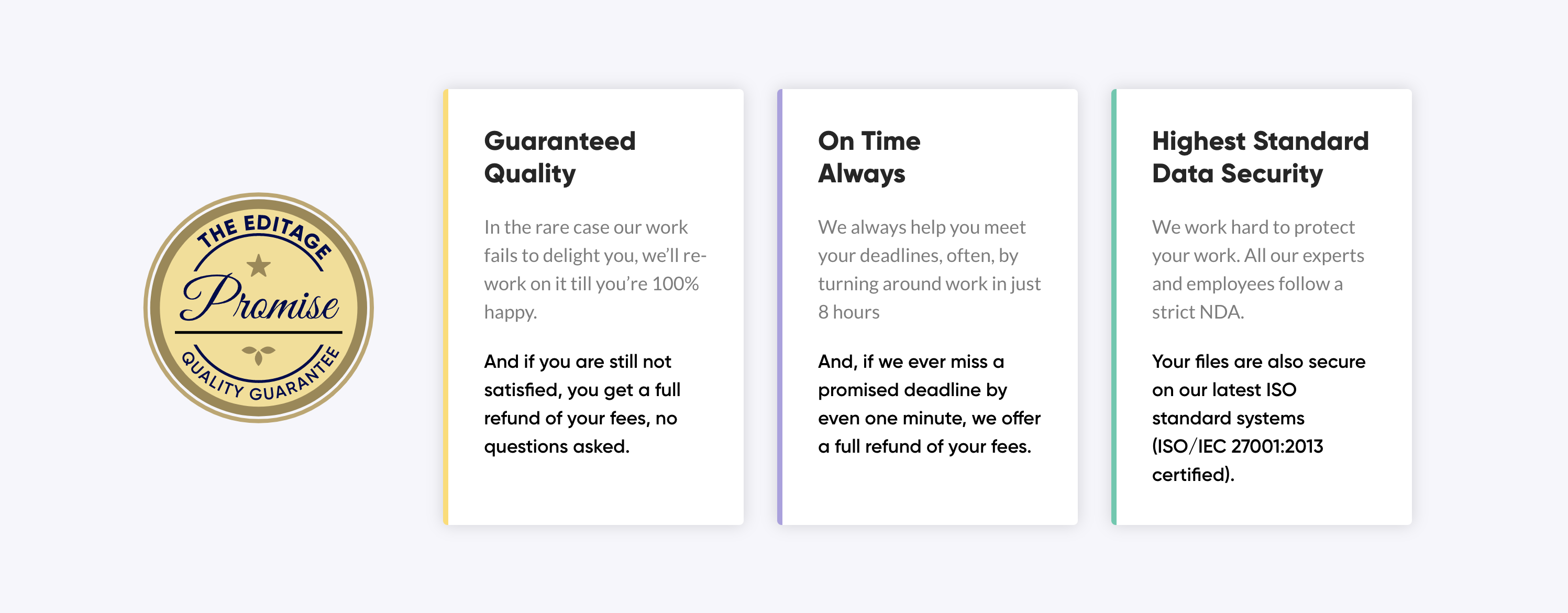
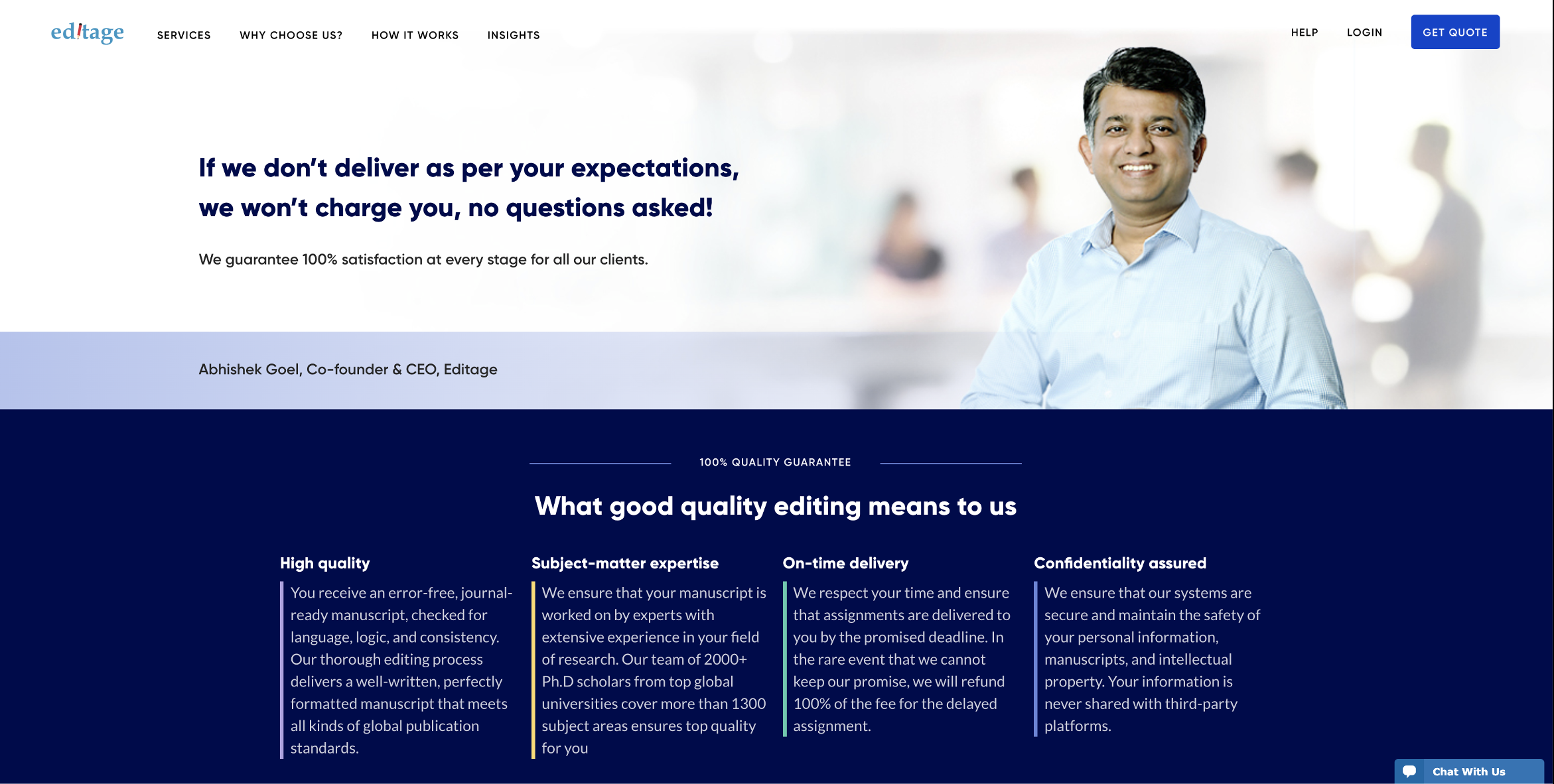
A stamp of promise on every offering, repeated everywhere, reminding the user their documents are in safe hands. We also have a 100% satisfaction guarantee — communicated by our own CEO, for transparency.
// 6. Our subject area experts
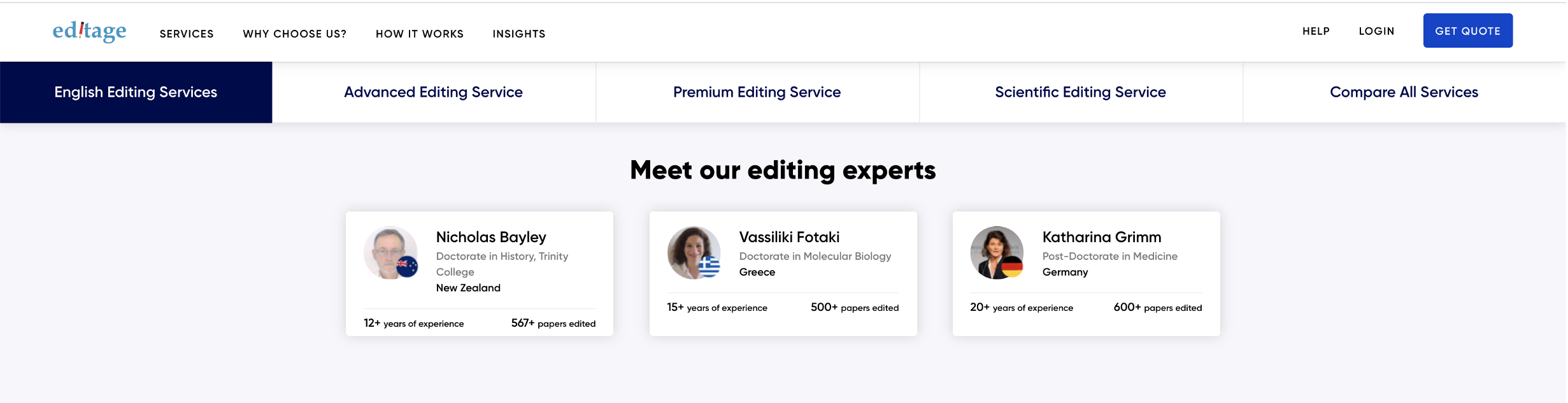
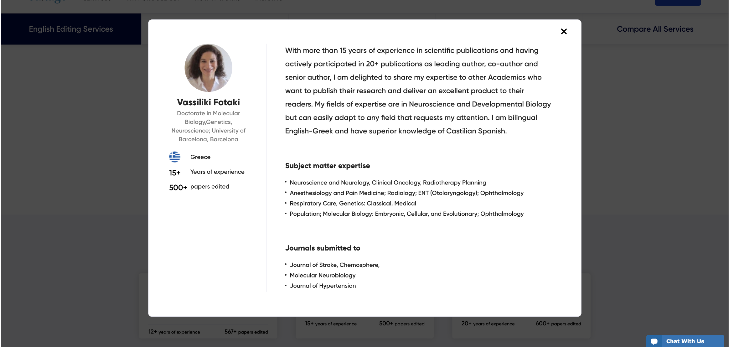
Our real strength is a panel of subject area experts who are native English speakers, matched to each document's field. Showing the panel lets users judge the quality for themselves.
// 7. Colour
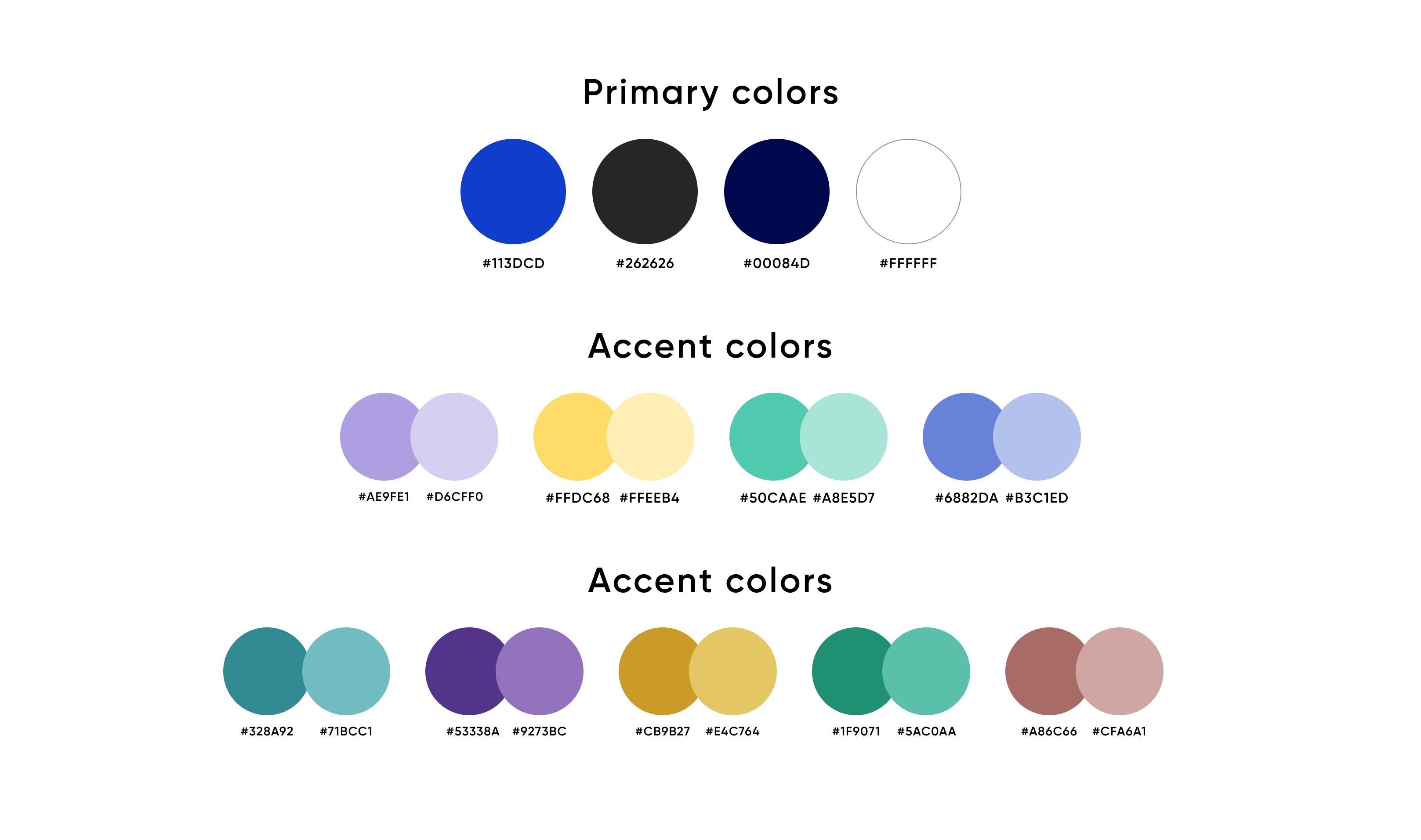
Colour is an understated language that makes a big difference. We needed to feel international and cover every subject area, so we played on the most neutral colour — blue — in a bright hue that makes “Get Quote” the first thing you see.
// 8. Type
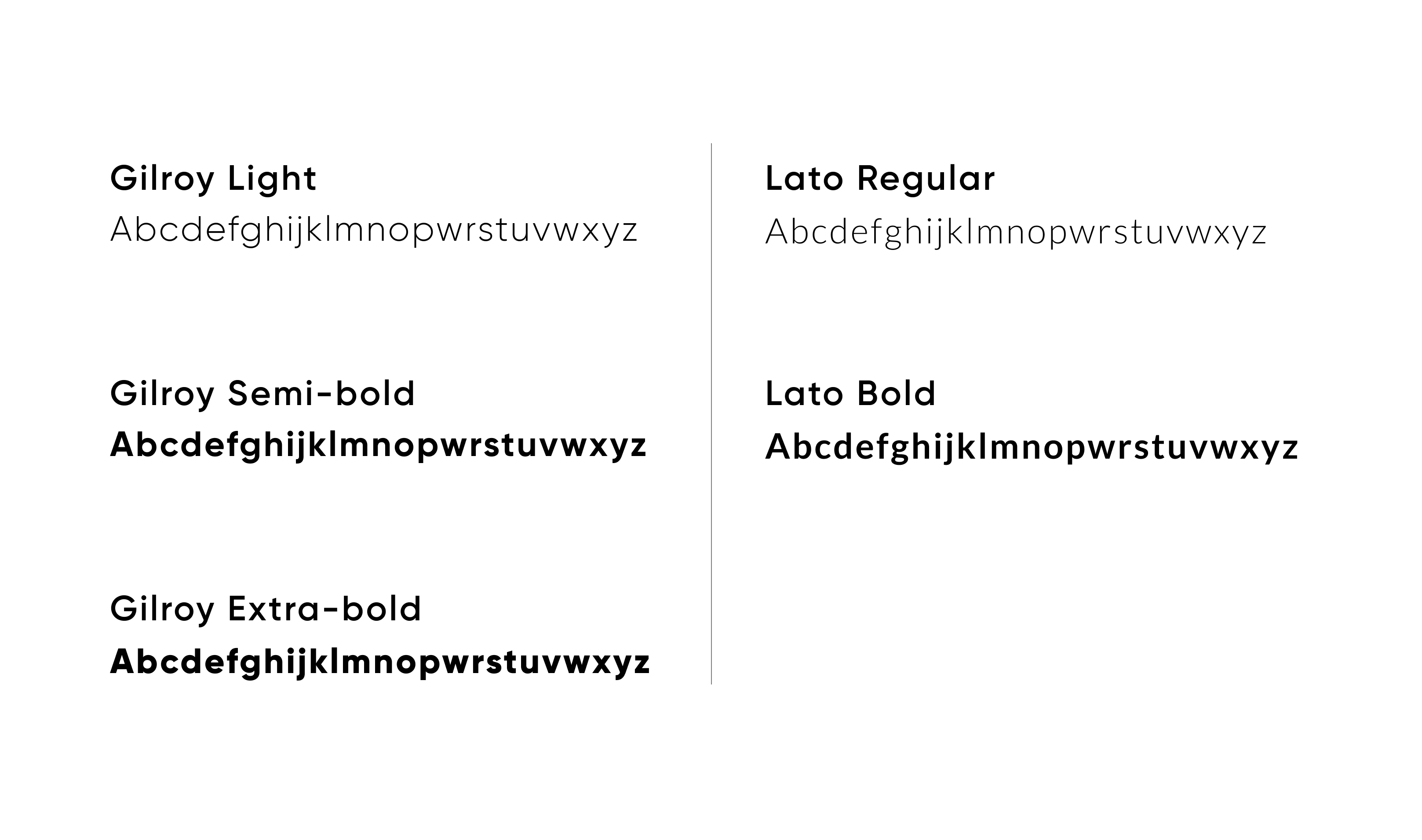
Fonts aren't something users consciously call out, but they set a mood as much as colour and imagery. Gilroy became the identity — contemporary and warm — with Lato doing the functional work in small spaces and long text.
// Outcomes
A modern experience with fast loading speed — and 8% additional jobs based on the Japan A/B test.
In China, 24% more users moved from the web into the forms, the form submit ratio rose 14%, and the web submit ratio rose 41%.
On the rest-of-world site, traffic rose 58% and jobs submitted rose 56%. Combined with service repositioning and cross-sell work, the programme drove $8M in incremental revenue and lifted average order value from $275 to $380.
This was a glimpse into a very large project that ran over months and continues to be enhanced as we learn more about users who keep surprising us.
// Next up