// 05 · B2B SaaS · Conversion · 2019 — 2022
Cactus
From drop-offs to delight: the Editage form funnel redesign
// Overview
The form funnel is the transactional flow a user enters whenever they click “Get quote” — most commonly from the top right of the homepage. This is where we want our users to be, and the ideal scenario is that they place an order.
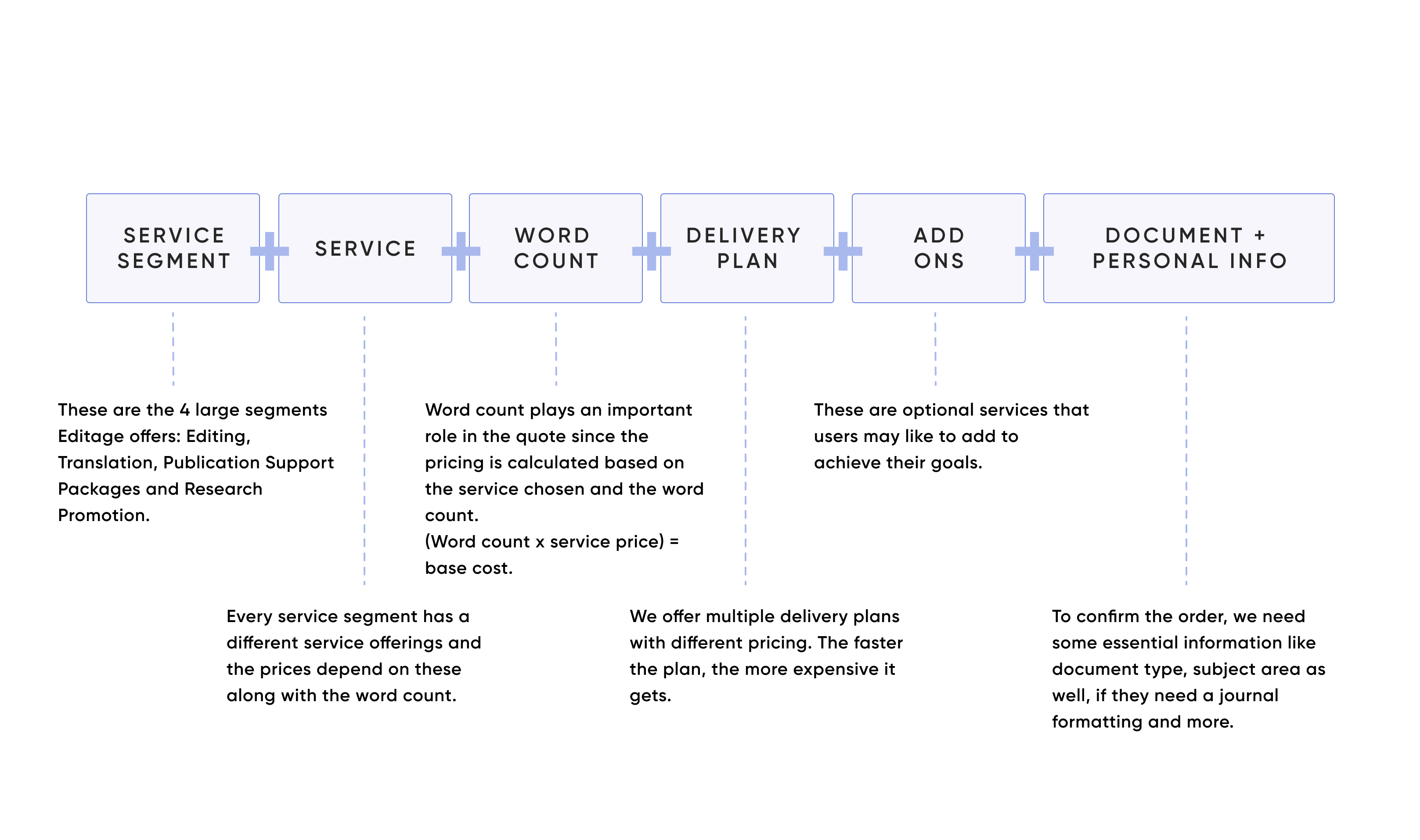
To place one, they must take a set of steps that shape the order and determine its cost. I redesigned that entire multi-step experience — simplifying the UI, clarifying the copy, enabling early document upload and introducing contextual upsell nudges.
// Problem & context
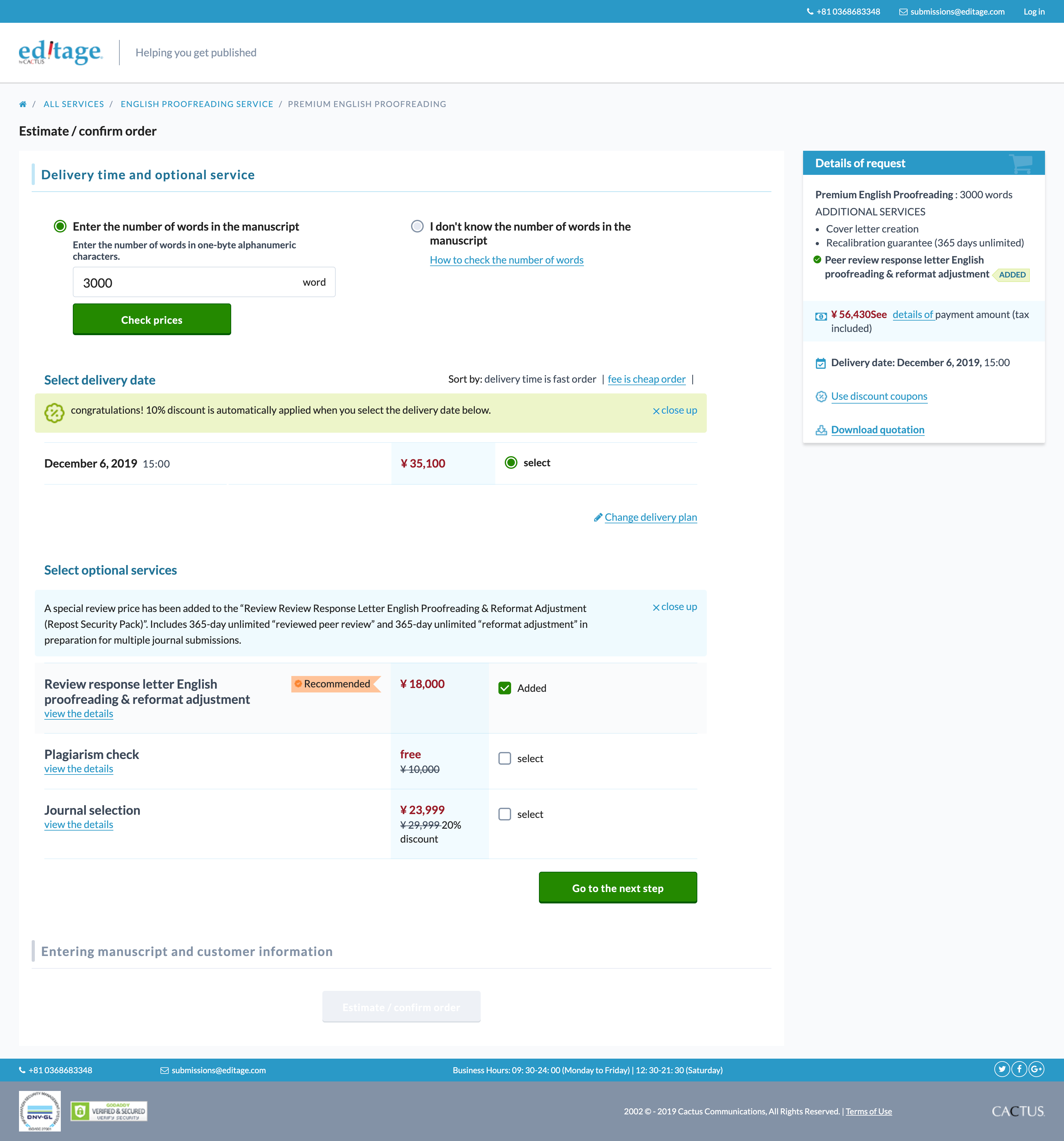
The old form asked for everything up front and explained nothing: no clear visual hierarchy, too many steps on one screen, and CTAs that weren't contextually visible.
Users didn't know what was expected next or why fields mattered — so they dropped off, quotes were inaccurate, and customer service absorbed a steady stream of “what does this mean?” queries.
// Process
// Where it starts
“Get quote” is the single most important entry point on the website — everything upstream exists to get a researcher to press it.
// The old form
Multiple steps crammed into one screen, weak hierarchy and no sense of progress — decision fatigue by design.
// Key areas of improvement
Establish a clear visual hierarchy. Divide the form into clear steps to avoid decision fatigue, so the user always knows what's expected next. Highlight positive experiences like getting a discount. Help the user make an informed decision. And make every CTA contextual and clearly visible.
// A new feature: upload to calculate word count
We let users auto-calculate their document's word count by simply uploading it — generating an accurate quote and removing the need to upload again at order time. It was also Editage's first step into automating parts of the flow, understanding the user better, and opening the door to personalisation later.
// The goals we set
Increase the web-to-form ratio from key pages by 10–15%. Reduce drop-off at SL1, SL2 and the Plan page by 10–15%. Increase form submit rate by 20–25%. Increase average order value by 10–15%. Reduce service requests to customer support by 40%. And upsell add-ons on 10% of orders.
The funnel asked for everything up front and explained nothing.
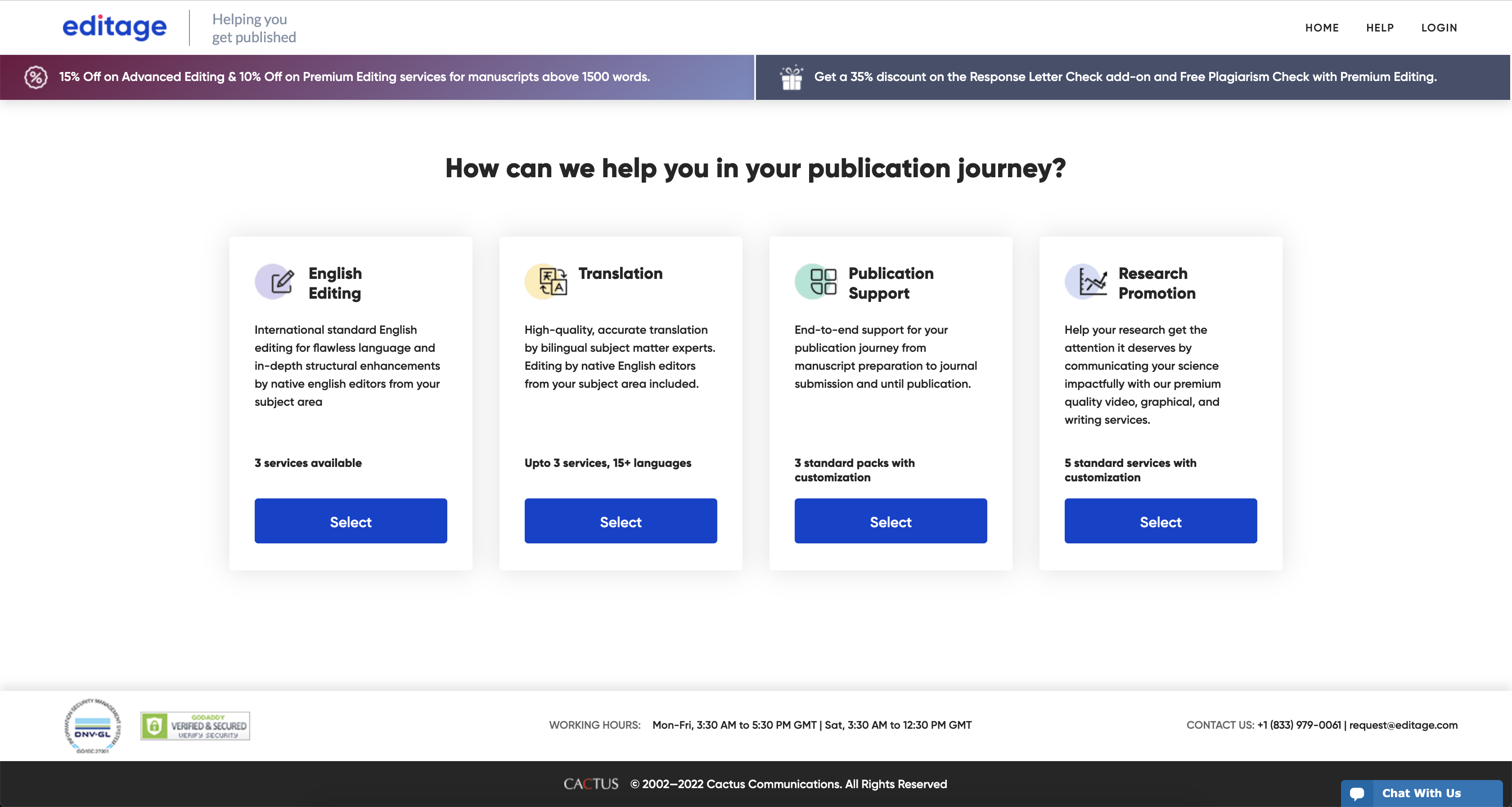
// 1. A cleaner UI with targeted steps
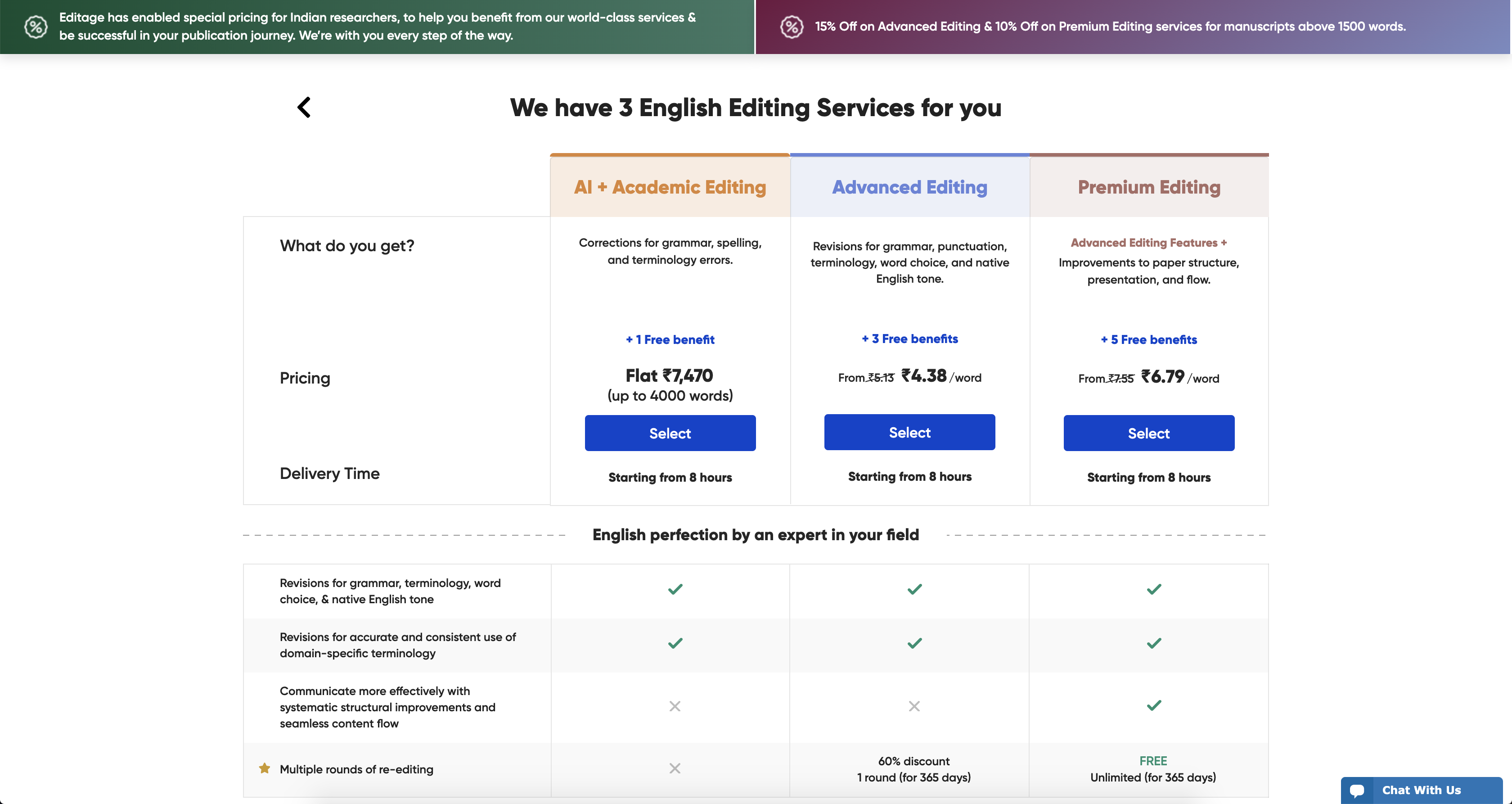
A fast site and a simple UI improved the funnel and gave us a solid foundation to build more features on. In user testing videos, people took action easily and moved where they wanted to.
// 2. Content that helps the user decide
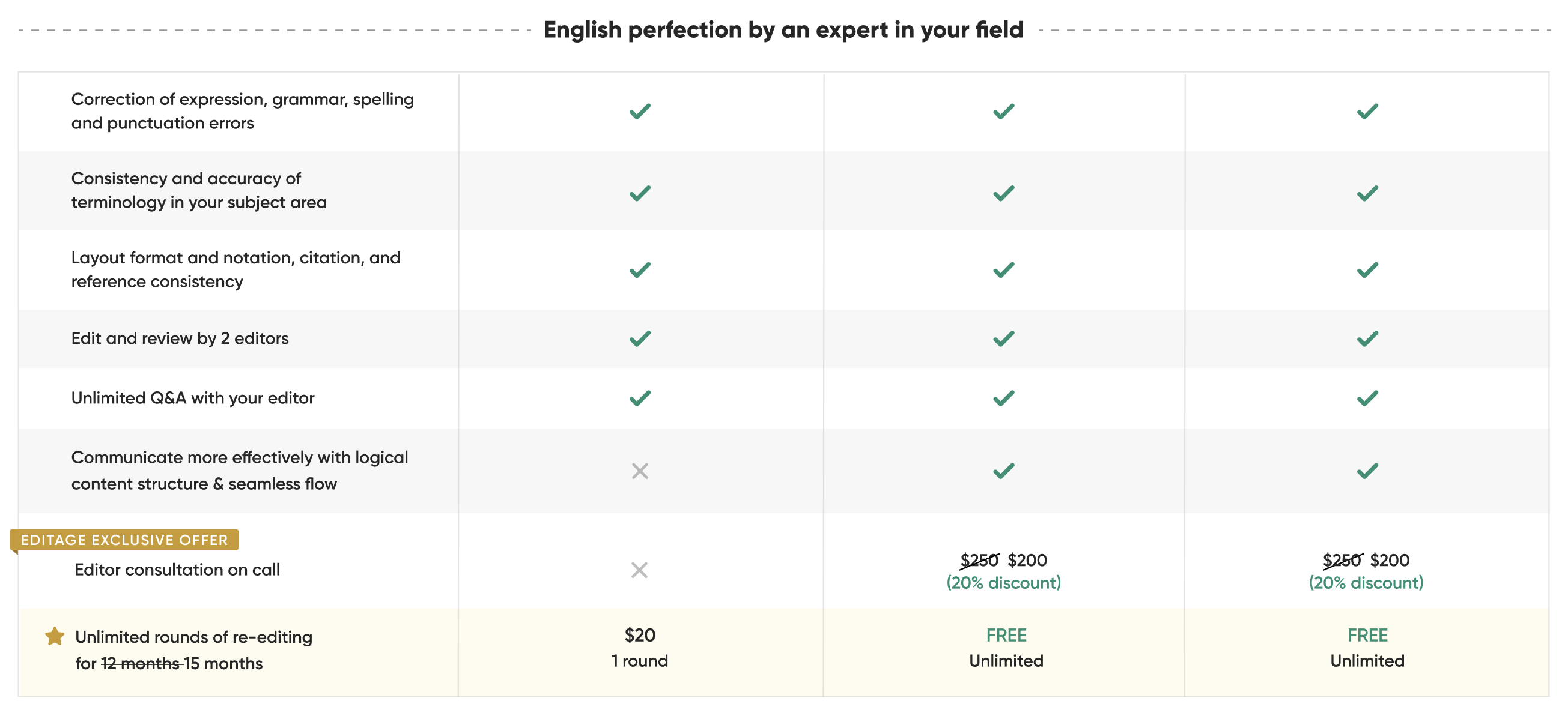
Service introductions, side-by-side comparison and add-on cards carrying benefits and social proof — placed exactly where the decision happens instead of a help page nobody opens.
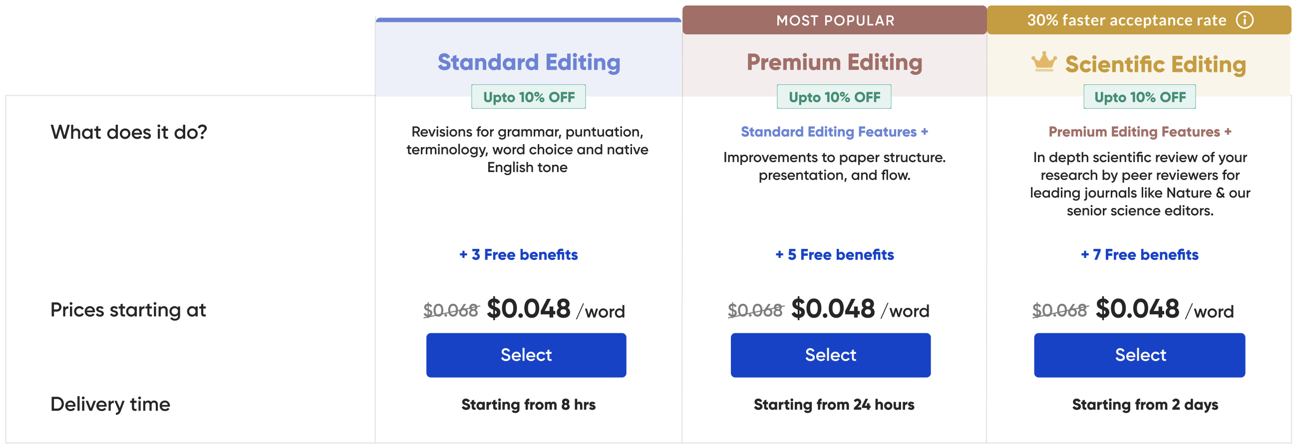

// 3. Service upgrade pitches
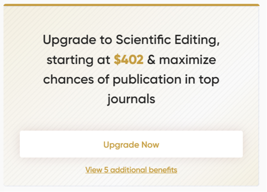
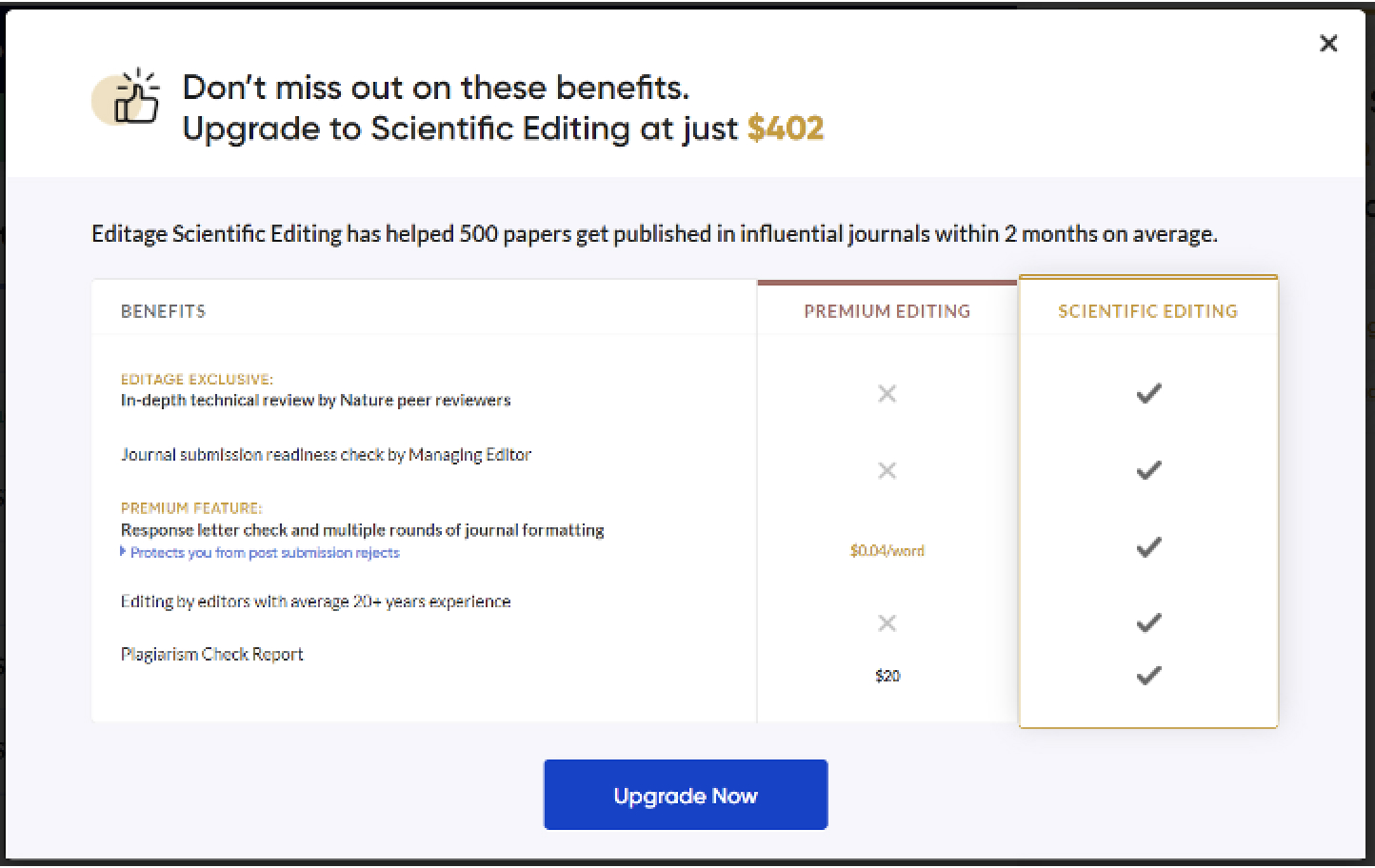
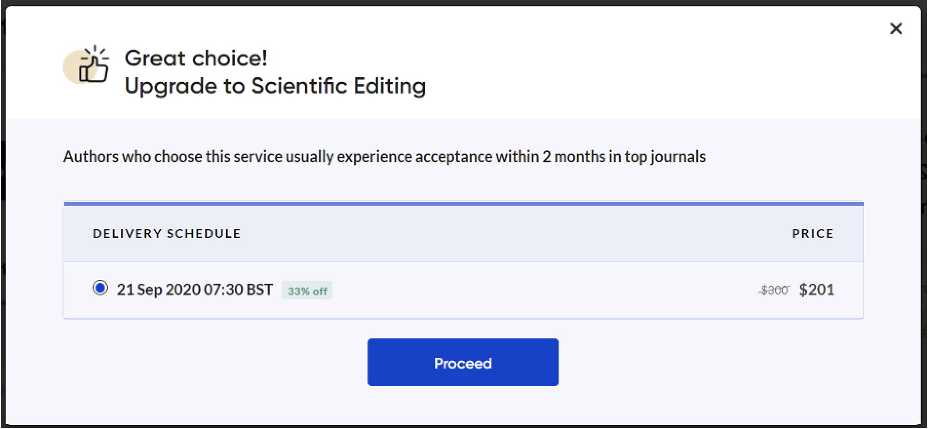
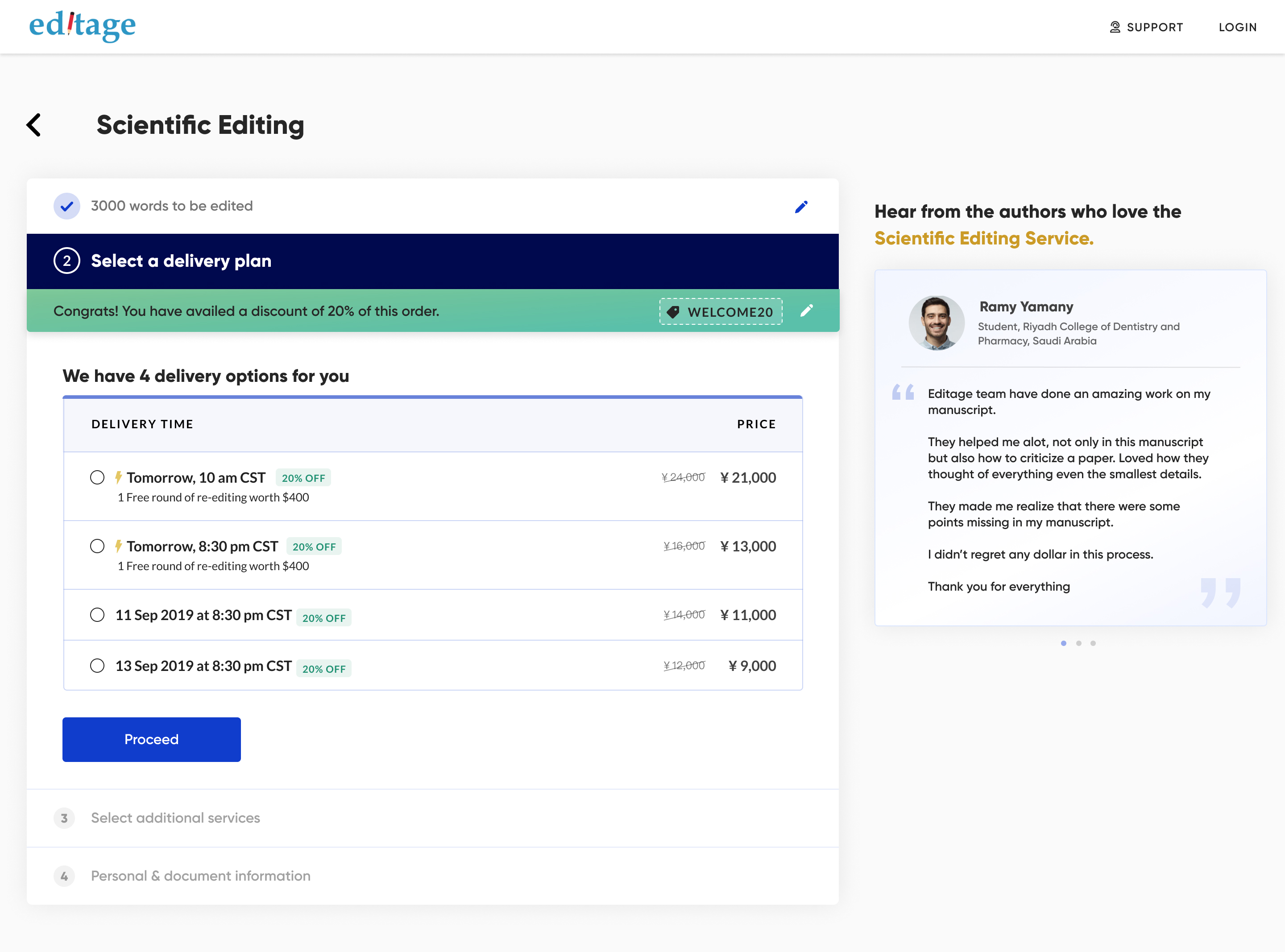
With AOV as a goal, we pitched the next best service on the plan selection page. 1.6% of users upgraded to premium editing and 8% upgraded to Scientific Editing — the top and most expensive service — directly lifting average order value.
// 4. Download quote made easy
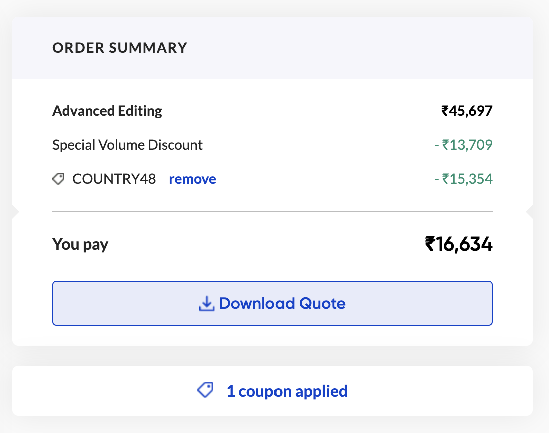
Researchers often need a quote document to get approvals and sanctions. We kept the order summary clean and made “download quote” prominent. That lifted downloads by 9% — 22% of users now opt to download, and 78% of those complete it and become potential returning customers.
// 5. Testimonials on Scientific Editing
We placed testimonials in the same space as the upgrade pitch to reassure users they'd made the right call. This alone boosted users going ahead with Scientific Editing by an average of 9% across markets.
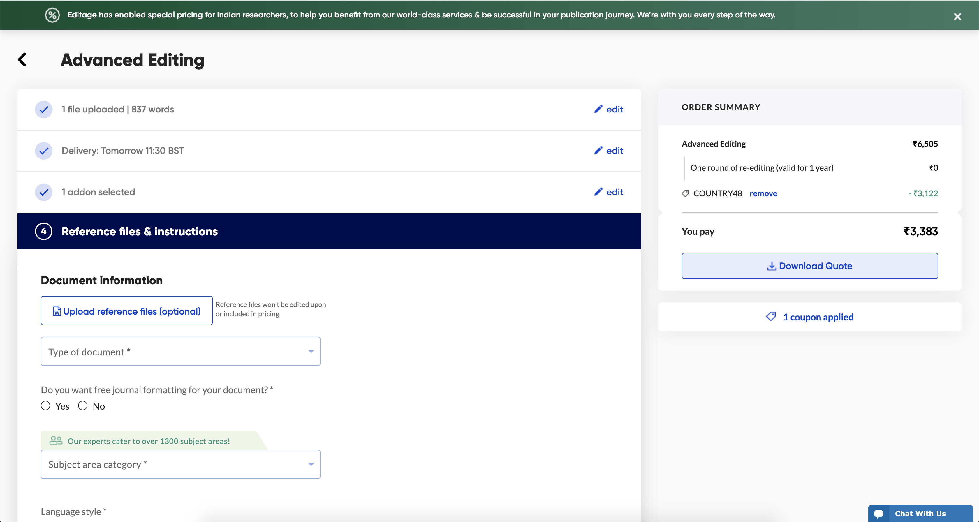
// 6. Pre-selection of an add-on
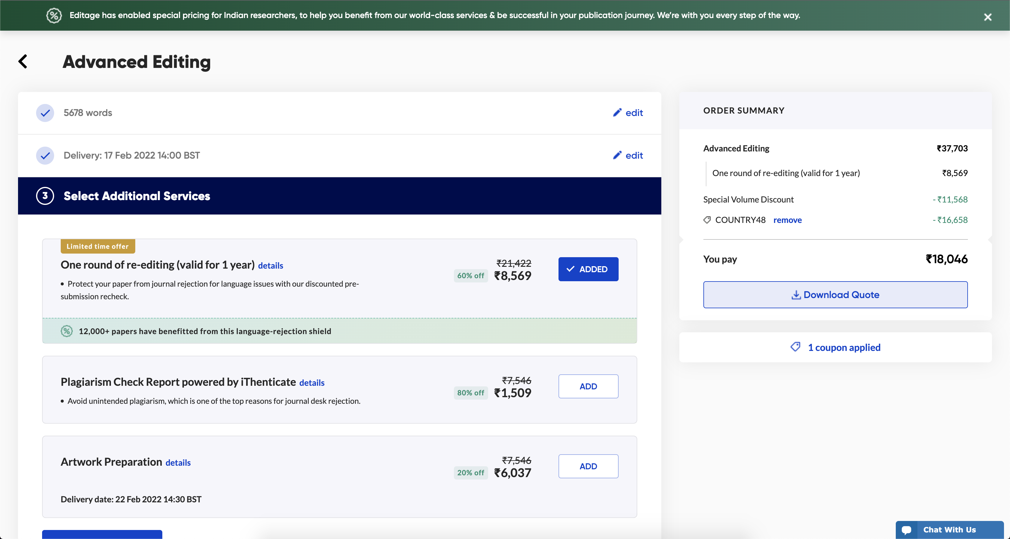
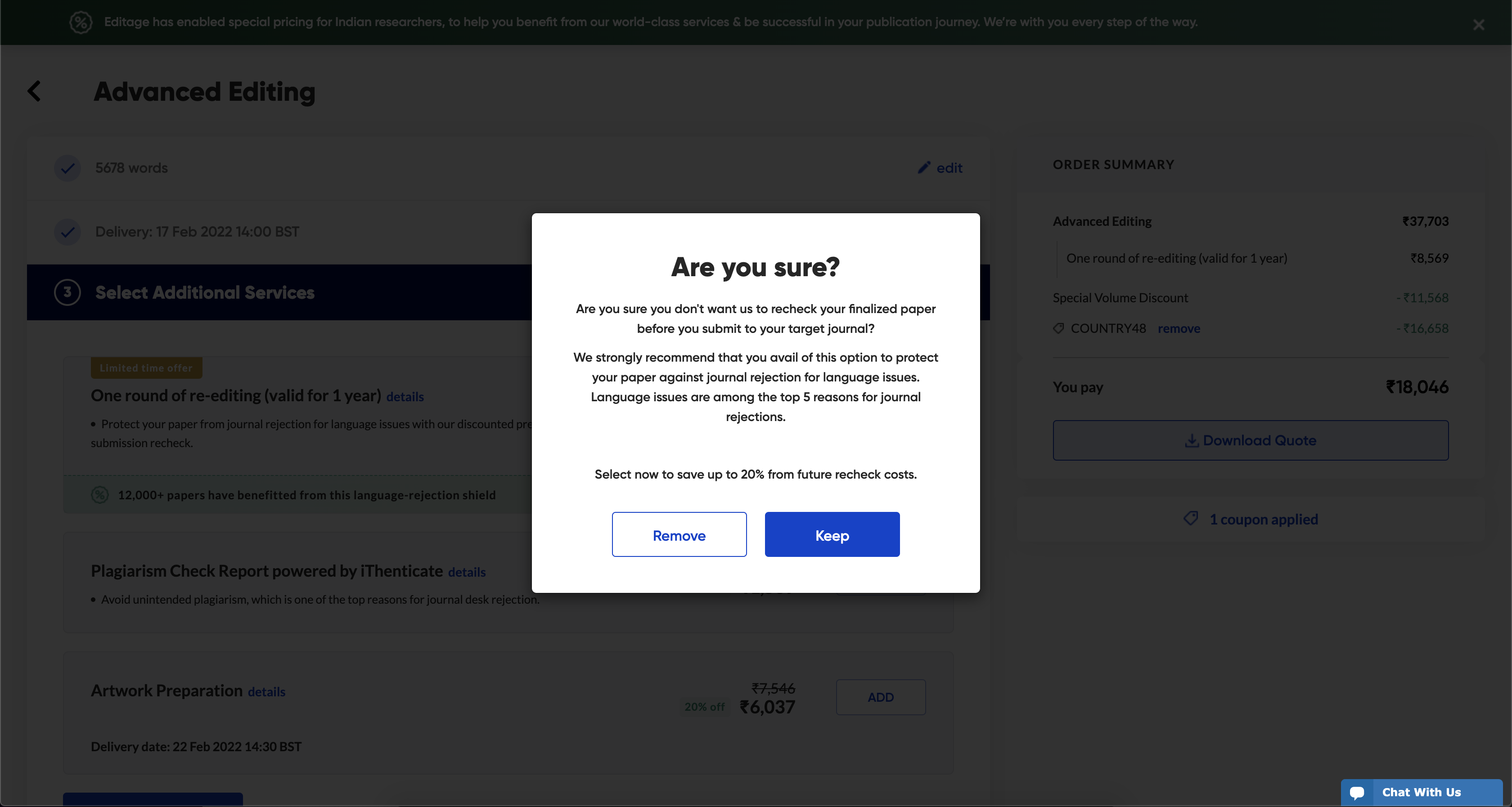
One round of re-editing is an add-on most users benefit from. We added it by default and gave users a clear way to remove it. That single decision generated an additional $40k a month.
// Outcomes
78% of users who downloaded a quote came back to place an order, with downloads themselves up 9%.
+9% conversion into Scientific Editing through testimonials and persuasive content, plus 1.6% upgrading to premium editing.
~$40k per month in incremental revenue from a single pre-selected add-on, and a notable drop in user confusion and support queries.
We've only scratched the surface — the aim is to shorten the form further, down to one-click booking once a document has been uploaded.
// Next up